Hi guys,
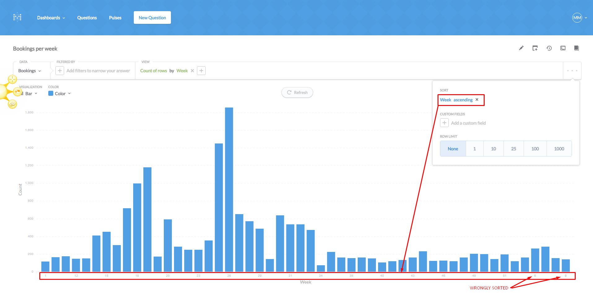
I'm counting the number of purchases I got per week, sorting it per week, so I can see the progress of my sales during the year, identify high and low seasons, etc.
The thing is although I'm sorting it per week and I see it right on the table view, all the charts (bar, lines, area) are wrongly sorted.
WRONG SORTING
Any idea why is that and how to fix it?
Thanks