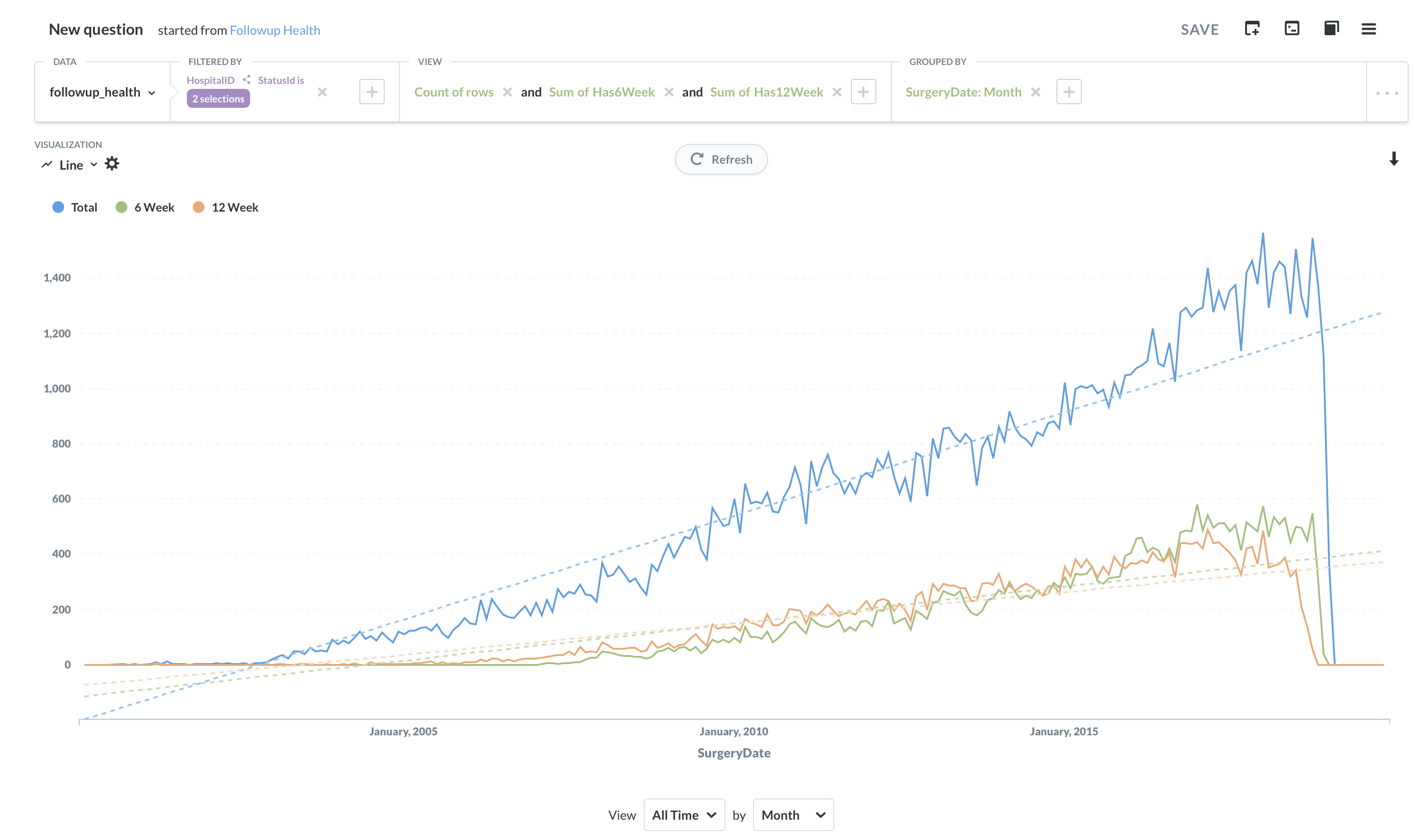
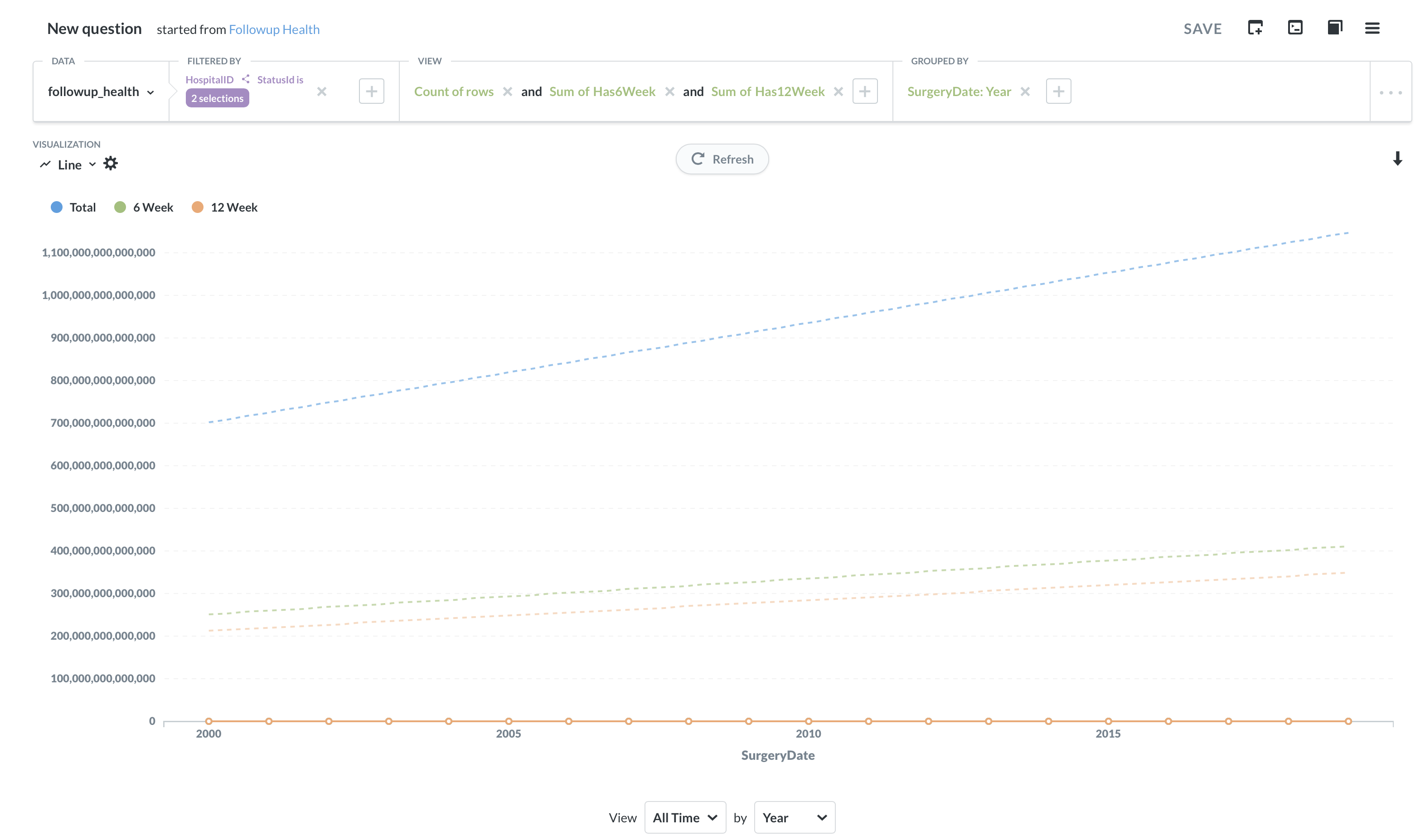
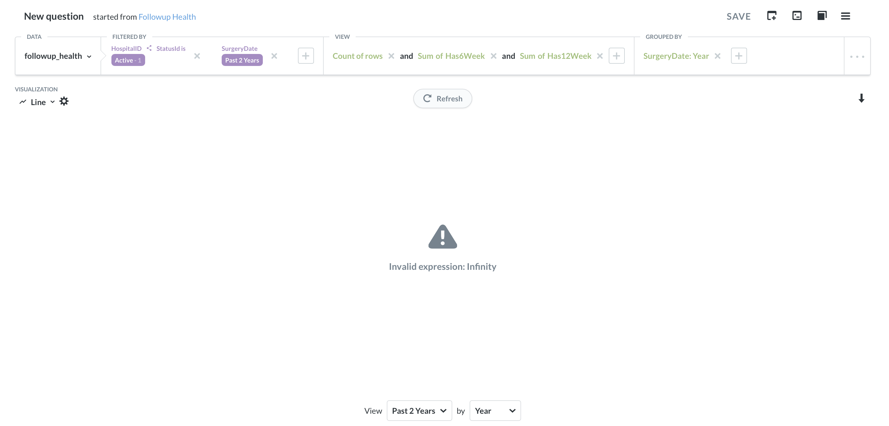
I'm not sure what's going on here -- I've looked at the raw/table data, and there isn't anything that should break the display axis in such a spectacular way. Grouping by month works, by quarter works, but by year breaks things.
Which version of Metabase and which database do you connect to?
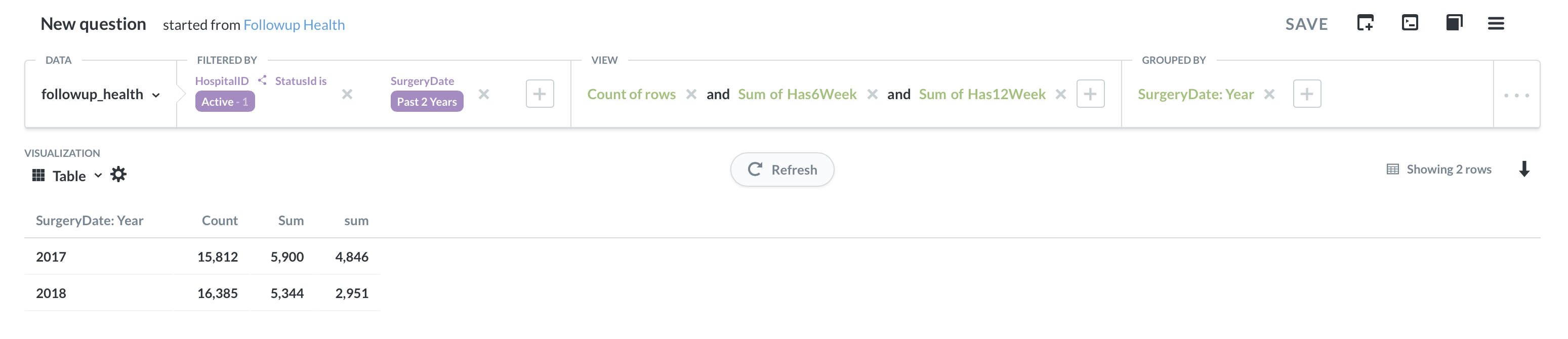
It looks like Sum and sum column are being interpreted as strings and not as integer, as they should.
Are you getting the data from a table or Saved Question?
Can you double-check your Settings > Admin > Data Model > (database) > (table) > Has6Week and Has12Week, make sure Type is set correct.
Thanks @flamber – it’s Metabase 0.31.2, connected to MariaDB 10.2.
The data is coming from a table (well, a view in a database); those columns were Category in the data model, and changing them to Number doesn’t seem to do anything different.
The SurgeryDate column didn’t have a type assigned, so I picked Creation Date (there doesn’t seem to be a general data type?), but that doesn’t help either.
So in the database, those columns are of the type INT or FLOAT ?
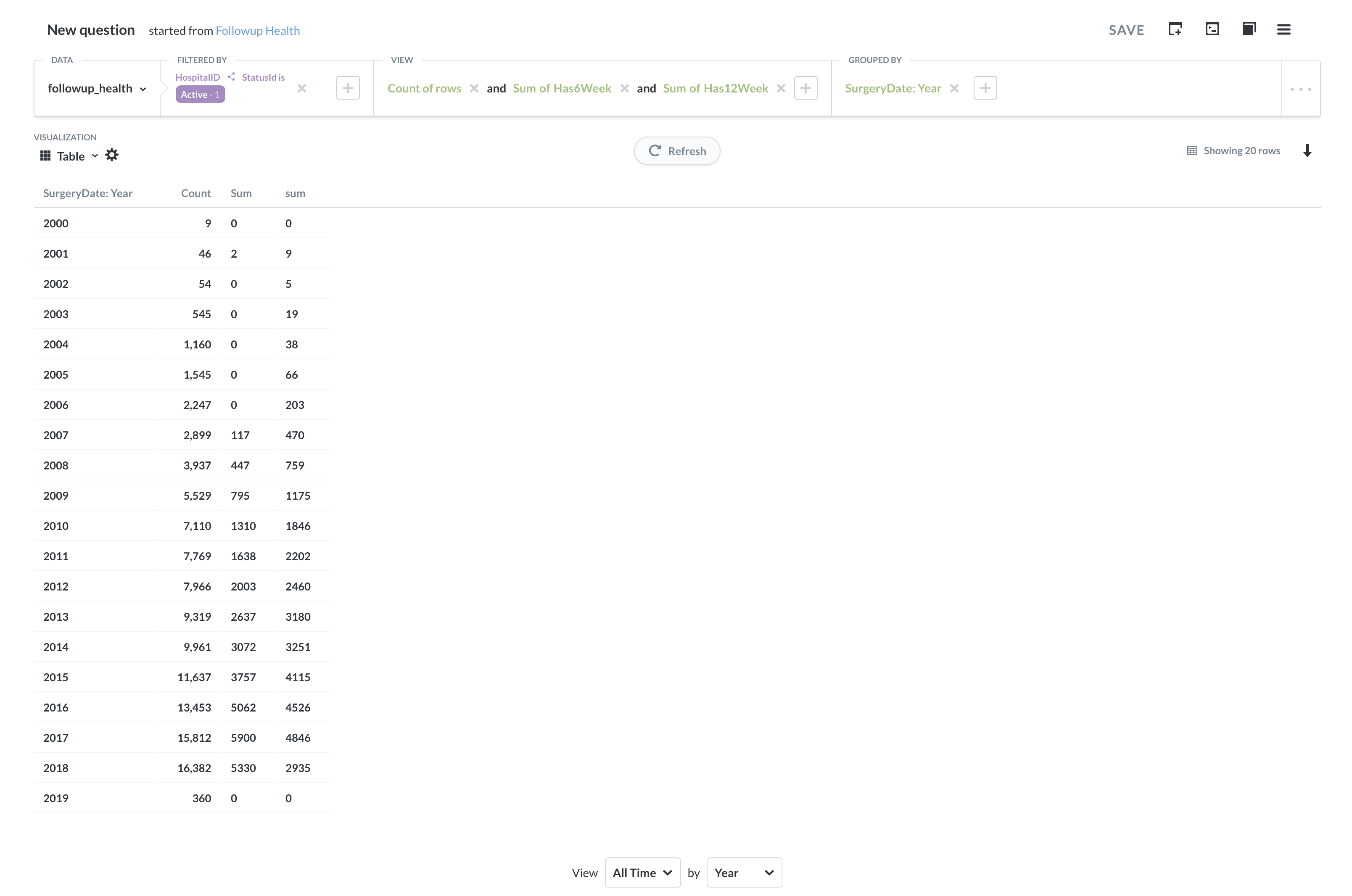
Interesting that when you limit to past two years, then the columns look correct.
Can you remove the “Grouped By” and then check all the rows. Even better, do the query in MariaDB and check the output.
But the “Invalid expression: Infinity” is a bug with trend lines - it was reported not long ago:
They’re probably INT (definitely not FLOAT), they come from using an EXISTS() clause in a view. The columns are correct even without the year filter, but the infinity thing doesn’t show up until being filtered. Everything seems normal with the query… the rows have values, and even ungrouped, there are only like 170,000 items.
Good call on the trend line! Grouping by year works perfectly fine without the trend line enabled… so that’s my actual problem I guess