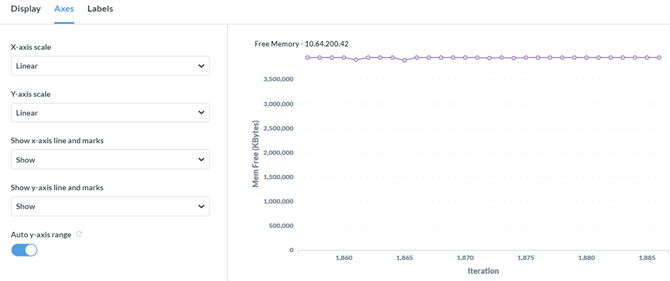
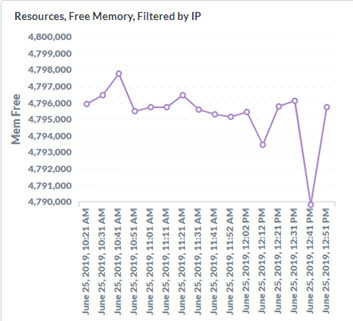
Metabase has a feature for line charts called ‘Auto y-axis range’ that automatically scales the y-axis value range, presumably based on the actual data values. That’s the theory anyway. What actually happens is you end up with a chart that almost always renders something close to a straight line which is also jammed up at the top of the chart. Kind of like this:
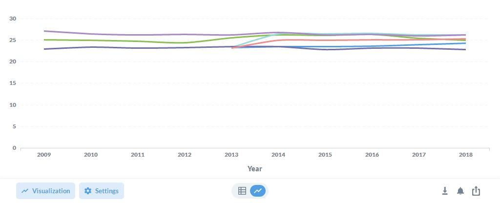
What should be produced (or rather what I would like to see) is a line displaying as much variation as the data allows with the median value centered on the chart, like this:
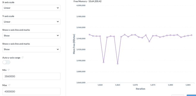
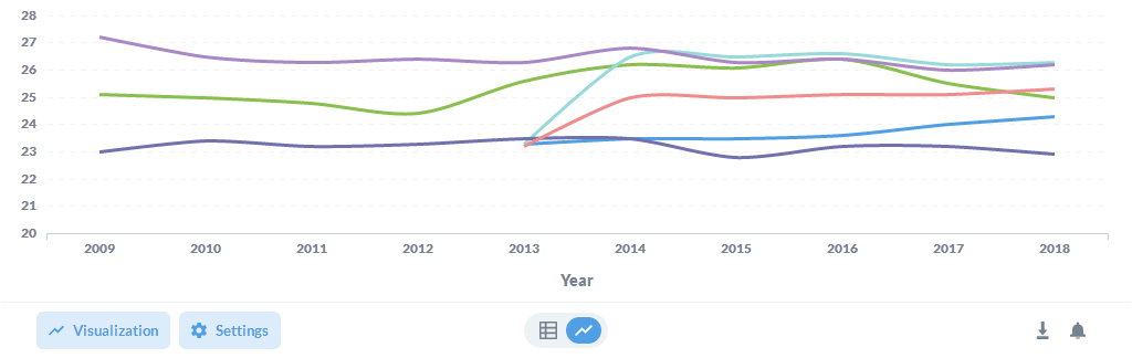
Currently, the only way to accomplish this is to turn off the auto ranging, entering min and max values. This works fine as long as the expected range of variation is known. If the range is unknown, you can end up with over- and under-shoots, like this:
The ideal solution would improve on the existing mechanism for setting the auto ranging by allowing the user to set two deltas representing a) the delta between the maximum data value and the maximum y-axis chart value and b) the delta between the minimum data value and the minimum y-axis chart value. This would center the plot and provide as much resolution as possible.
Am I missing and existing capability? Anyone experience the same a find an alternate solution?Suggestions?