Hi community,
I am rather new but learning quickly. My most complex task is to create a daily bar chart showing the shift close imbalance of a restaurant. This to be used to check up on employees.
The formula is cash_in via sales - amt_paid_out + shift start amt - shift close amt
Each of the terms is a separate field in the sqllite table. I can easily constuct four bar charts representing each term of the formula, but to be useful, the four terms need to be combined to render the single value of shift_close_imbalance, which can be plus or minus number by the way.
Any ideas? I think what i can learn on this one will give me all the tools i need to create my report library
thanks in advance
Regis.
Hi @crwheelr
There are many different ways to do that, but it sounds like you're on the right track.
Example, I have a card, which shows missing inventory count for multiple places over a date range, and then I also have a simple number card, which shows total.
Thank you flamber. some of the terms of the formula are negative numbers. not sure if the stacked bar chart would indicate that correctly. any thoughts on this?
regis
@crwheelr
The bar supports positive and negative numbers without any issues, but when using stacked bar with a combination of positive and negative numbers, it messes around with them, so sometimes it might be overlayed.
But you can get around that by sorting by the value, but that doesn’t work in my case, since I need sorted by date and place.
I think your best way forward: Simple test a lot of different visualizations and with different settings ( ) to see what makes the best viewing experience for the user.
flamber,
Please elaborate on sorting, do you mean adding all the negative terms first, then the positives, or visa versa?
Is it straightforward to combine the separate charts into a composite one? I don’t recall reading that?
regis
Yes, sorting lowest to highest could be a solution, if you don’t need other sorting.
You can combine multiple cards (questions) on a dashboard, but if you’re doing the query in SQL, then it can be really tricky to make them compatible:
https://metabase.com/docs/latest/users-guide/09-multi-series-charting.html#combining-two-existing-saved-questions
thanks so much flamber. I will give this a go tonight.
Regis
flamber,
I set this up accordingly and I suppose as expectec the stacked bars obscure one another because of the direction reversal when a value is negative. I tried lines, area and bars, Lines cannot be stacked so that is out. Bars is about the closest. I see a feature request here but dont know if dev team is open to these. Its pretty simple. One can customize the color of a bar. Request would be that the color be transparent. In my scenario where one only wants to see the sum of the stacked bars and not the stacking components, all bars would be set to tranparent. Then a final bar of prescribed minimal amplitude value would be the last to setup in the stack, and it would be set to a color. This would work splendidly having the graphing option for transparent color.
I can make a feature request but not holding my breath. Can you think of any other way to achieve summing of multiple terms of a formula?
thanks
Regis
@crwheelr
Can you post screenshots of what you currently have, and how you expect a feature request should look.
I think I understand what you’re after, but I’m a little unsure, so a few images would help.
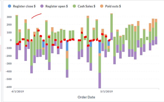
I don't see my jpg uploading but perhaps it did. Normal stacked bar works nicely if all the terms are positive, but in my example i am trying to construct a daily restaurant shift close report, that indicated shortages and surpluses at the end of each day .
Starting amount is an added term
ending amount is a subtracted term
cash sales are added
cash paid out transactions are subtraced
Interpreting the stacked bar chart to give the final plus/minus of the register is difficult if not impossible
my suggestion would yield the red markep on the chart only
Its like this, all four groups above would be transparent, then i wouuld create a 5th group of fixed value of 1. that would use a oolor in the chart. the result would be dashes across the chart area showning the integrity of the shift close. once this is working i will filter it by cashier etc.
Hope this helps,
Regis
@crwheelr
I think you should probably use something like Custom Expression or Custom Field to sum all the four columns into a single number of the day, which you can then display in a bar chart with goal line at 0.
The current positive/negative handling on stacked charts is not great, but there was actually a couple of fixes today - I haven’t tested if it fixes this specific issue.
Hi Flamber,
Your suggestion was the first thing that I tried, that is combining all the terms into one Custom expression. Issue is that each term is a different record in the table. the qualifier for which type the record contains is in the record.type field. Would i make sense to create four Custom Fields each would only enter the term’s value if the record.id criteria is met, otherwise null. Them a Customer Expression that simply sums all four of the custom fields.
If you think this might work, can you just reference me where to create custom fields?
thanks, we can term this thread at this point. thanks for all your help. If this doesn’t work. I’ll just make a stored procedure in the native sqllite database to calc this in the table and simply report that number.
Regis
@crwheelr
I’m not sure if Custom Fields are going to work, like you want.
https://www.metabase.com/docs/latest/users-guide/04-asking-questions.html#creating-a-custom-field
Instead of SP, I would recommend a View, since Metabase will see it as a regular table, which gives you a lot more functions like drill-thru and the option to use the Query Browser. But it all depends on what you’re trying to do and if you want the users the look around in that data.
Really do appreciate the support. Decided best way to go is to pre-process the table data to render a singular column that contains the desired result. So I’m going about scripting a couple of triggers to do just that.
Take care,
Regis
1 Like
flamber,
I found that the easiest way to solve this is to create a custom trigger on my database, that to make all the calcs needed for the barchart needed.
i have another general question. There is desire that the metabase engine be running on the computers where the databases reside. This must be on two local computers that serve as point of sale in the two restaurants. But I would like to access questions and dashboards from the two locations from say my home location. Is this possible, and can you refer me to any guidance or documentation on this?
thanks
Regis
forgot to mention, the POS database is of type SQLlite
@crwheelr
Great you found a hack that solved your issue 
Without knowing your network, it’s not always easy to give a solution.
But if each location want to run their own Metabase instance, then they can - of course they wouldn’t be able to query the other location’s data, and you would have to maintain two instances with probably the same dashboards and questions, so you would have to manually create/update those on each instance.
If you have some sort of VPN option to both locations at the same time, then you could have a local (home) Metabase instance, which would just have two databases as data sources, linking to the SQLite files via a network share.
 ) to see what makes the best viewing experience for the user.