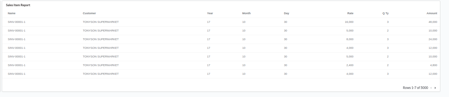
I have a Date in Metabase that i want to convert to seperate entity like YEAR, Month and Day.
I have tried;
TO_CHAR(c.post_date, 'DD-MM-YYYY') AS "CUST_CREATED_DATE"
TO_CHAR(c.post_date, 'DD') AS "CUST_CREATED_DAY",
TO_CHAR(c.post_date, 'MM') AS "CUST_CREATED_MONTH",
TO_CHAR(c.post_date, 'YYYY') AS "CUST_CREATED_YEAR",
I want to achieve this so that i can add my period (YEAR, MONTH and DAY) to my Chart or Table in my dashboard
What is the best practice to that.
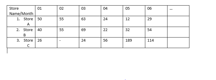
I just noticed now that there is no Pivot Chart here on Metabase. Is there any other chat i can use to work with. Currently i have a report that contains 3 Fields.
Store Name, Month and Sales Value. A table will not help me achieve this unless i use a pivot table.
Any help please. lemme show you the result of the Date Conversion.
Hm ... I a not sure. As you split the date in several bits (text bits) metabase is probably not able to show a timeseries or any other chart based on date. And for other charts I think there are too many data in your table.
How would the ideal result look like for you? I guess Store name as x axis and date on y axis and sales value as cell value? That could be achieved by not splitting the date - but I guess I haven´t understood why you need to split the date up?
I agree about the fonts - what is it about modern web apps and tiny pale grey text? As far as I can tell, the only way to change the fonts and colours is to recompile. The way Metabase is written means that the style information is scattered all around the compiled code. In the source, it is nice and neatly arranged. So far, I've managed to recompile with green replacing the blue headers. Just working my way through the rest. Would be nice to have something easier though.
Hi,
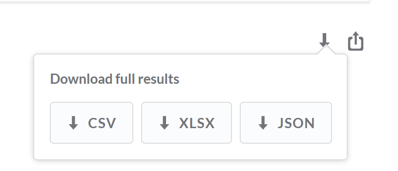
you can export questions, not dashboards. So when you are in question mode, there should be a small arrow at the right site of your question, allowing you to export to csv, xlsx and json.
I just tried adjusting the font size using CTRL-+ and it worked very nicely. In fact, I was very impressed with how well the different charts rendered.
Only issue I noticed was in horizontal bar charts and that was just some of the bars disappearing as ‘Others’.
Post 40, you find all sorts of ways to adjust things like that! If I only I could prevent washed out grey text on a white background, my life would be much easier.
I did a lot of work for the RNIB (blind charity) a few years ago on making analytics available to their Visually Impaired users. It’s sad how in the last 10 years accessibility seems to have gone backwards.
yes I am hoping that in a new version somewhen users (or at least admins) can select the colour coding.
Just to be sure, you know that a dashboard in fullscreen mode can be turned to night mode, means black background and bright lines/fonts.
But that does not apply to dashboards in normal screen mode or for questions.