Maybe the solution is to transform it in Date. I could say 2012 is 01-01-2012, and so on. However, I dont want the x-axis to show a complete date-time when data refers to a whole year.... Is there any to transform a column containing years in Date format?
As I use v0.25 and not the most recent one that might be something that occured in the newest version (I hope not).
Do you have the same problems with bar charts or tables?
If you have the year field as a date as well you can group the date by year, that maybe solves your issue?
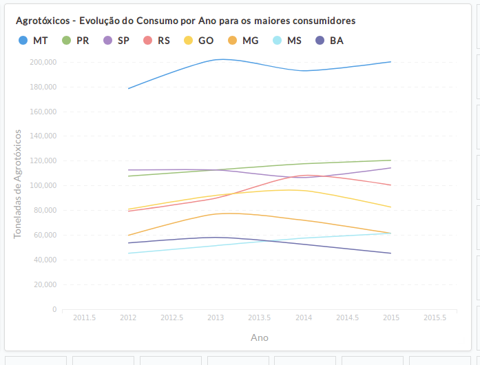
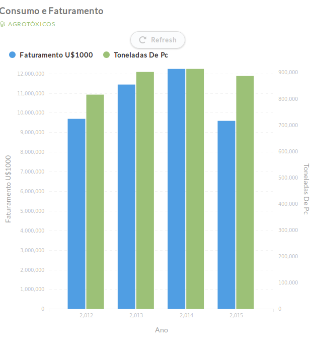
Well, maybe your chart looks better because it has more points. But in yours, as well, there is a unnecessary large space (of one year) between the y-axis and the begin of the series - the same in the end.
The problem of having decimals (2011.5) is related to the width of the chart. Depending on the width, it inserts or not decimals.
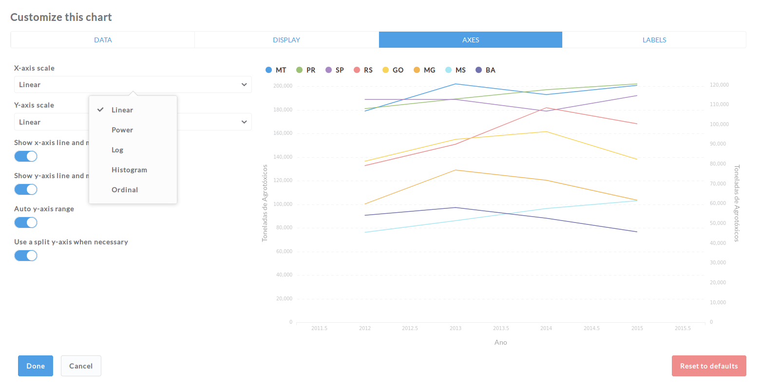
There a X-axis scale -> Ordinal option, which solves this. But then I have to insert a ORDER BY clause (and thus loose my visual editor) to guarantee years are shown in the right sequence.
I is now clear for me that Metabase, although already very powerfull, still has a lot to advance specially on visualization options (which are kind of endless, ). If we decide to adopt Metabase in our project (hope so!), we'll surely consider to contribute to it.
I hope in the next versions of metabase they will work on more visualisation
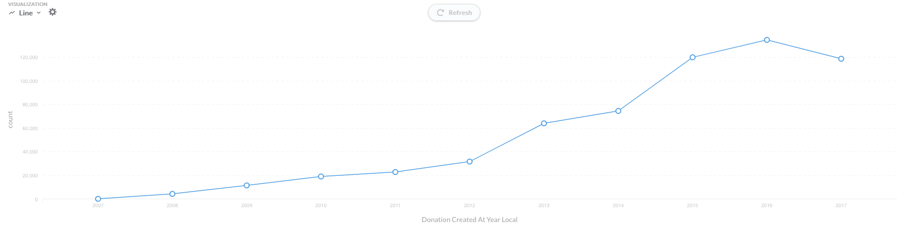
It is still interesting for me that in my graph the number is not shown with the thousands separator but in yours it is … .
And you are right that there is a huge gap at the beginning and end of my graph, I haven´t really noticed as I have more data points.
I build all my queries with the SQL editor and not with the metabase query builder and I don´t see that gap in my graphs. But in my graphs I also don´t use the simple year field for the x-axis but the proper date field with manipulated format.
I hope you can figure it out!
Sorry my initial attempt at giving advice didn’t work out. As I don’t have your data it’s easy to just end up guessing. Upside is at least it got you started on trying out some different options.
But then I have to insert a ORDER BY clause (and thus loose my visual editor) to guarantee years are shown in the right sequence.
Well for sorting you don’t exactly have to drop down to SQL mode. In the question editor if you click the ... box to the far right you get the option to sort on fields.
What you pointed to yourself - that if you set the base type to Date Metabase can probably give better guesses at building the right visualization. Though the ordinal setting in the visualization sounds like a sensible compromise if you only want a resolution of full years. I’m also suspecting that your setting of Class might lead Metabase into thinking that the order of the years don’t matter, and that you then need to sort in the first place.
Regarding the gaps at the ends my thinking is that it’s a really hard thing to actually build something that looks nice for all combinations of number of data points and visualization sizes and x/y dimensions. I personally wouldn’t get to hung up on it being pixel perfect in all cases. Just think about how it’s also supposed to work when viewed on a phone in both landscape and portrait. And if your primary use ends up being embedded somewhere else you might be able to adjust the space there for the data you have at hand. Another option if you have gotten yourself really mad at the extra whitespace might be to combine several graphs side by side in a dashboard.
Phew - that ended up being a really long rant. Hope it’s of some value
Has there been any more thought on being able to manually set the X Axis scale for time series charts similar to the Y Axis feature? Ideally exposing, these values in such away that if embedded on a dashboard they can be changed. Getting more adventurous, it could then potentially allow horizontal scrolling along the time axis while keeping the displayed time window constant.