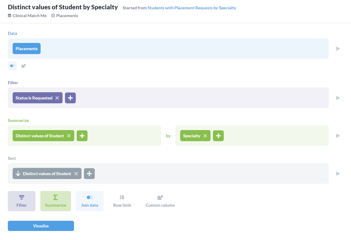
I created the following question in Metabase 0.37.1:
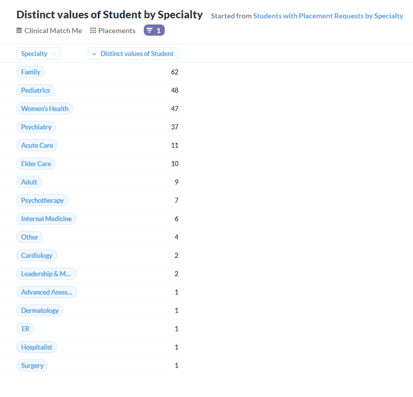
The question works fine when displayed in table view:
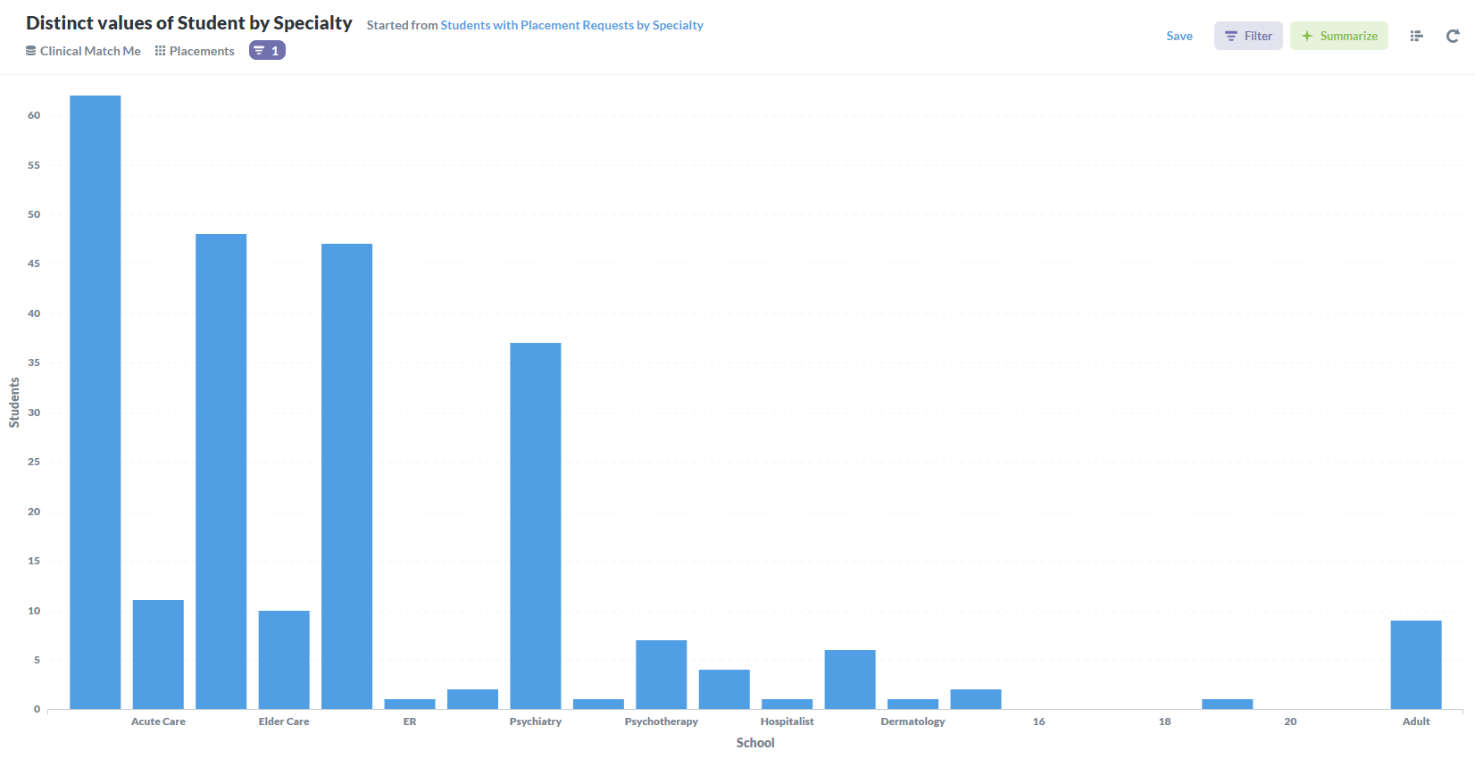
However, when displayed as a bar graph, the group by column is not sorted and some of the group labels are missing:
I created the following question in Metabase 0.37.1:
The question works fine when displayed in table view:
However, when displayed as a bar graph, the group by column is not sorted and some of the group labels are missing:
Hi @bkonia
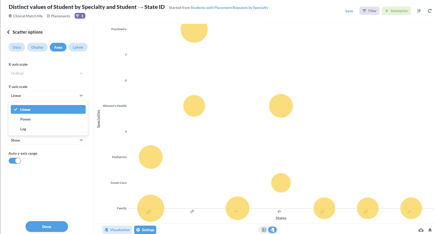
Set X-axis scale to Ordinal, then it both fixes the X-axis tick labeling and the sorting:
https://github.com/metabase/metabase/issues/13255 - upvote by clicking  on the first post
Thank you, that worked.
Now, I have what seems to be a similar issue with a scatter chart. Notice how the Y axis is filling in numbers for specialties that have no placements. I believe it's because it's treating the Y axis scale as Linear, but in this case, there's no option to change it to ordinal. How can I force it to ordinal?
Also, notice how the bubbles are covering the state names, making it difficult to read. It looks like the entire Y axis needs to be shifted up.
@bkonia Not the same problem. Y-axis cannot be ordinal, since that’s not how that axis is built.
I don’t think it’s the right visualization for this - I would probably use table Pivot.
Looks like this is what you’re looking for:
https://github.com/metabase/metabase/issues/11896 - upvote by clicking on the first post
Thanks for the info. I changed the visualization to pivot with conditional formatting and it looks a lot better.
Regarding the bubbles, I was referring to the bubbles in the bottom row completely covering the state name labels. This is caused by the bubbles being rendered too low on the axis, not because of their size.
@bkonia I understand that, but without being able to scale, then some bubbles might be too close to the edges and perhaps overflowing depending on size. Putting the bubble inside of the axis isn’t a great solution either, since it might not show certain bubbles depending on sizing.
I think the current behavior is the lesser of the two problems.
But you’re more than welcome to open issues with reproducible steps from Sample Dataset.