hi folks
I have a query producing a table of two columns of integers. I'd like to chart them as a bar graph, but that option is presently greyed out, and I don't understand why. Clues?
Thanks for your time ![]()
Matthew
hi folks
I have a query producing a table of two columns of integers. I'd like to chart them as a bar graph, but that option is presently greyed out, and I don't understand why. Clues?
Thanks for your time ![]()
Matthew
Hmm. Are you able to click on the bar graph option even though it’s greyed-out? Metabase tries to suggest which visualization types are most sensical for the current table or result set, and it greys out options that it doesn’t think make sense, but you can still select them. I think we might need to revisit the way we approach this, particularly because we now allow users to plot raw, unaggregated tables using the visualization options, etc.
Another thing to look at would be the settings you have for the fields you’re trying to graph in the Data Model section of the Admin Panel. Metabase looks for one numeric column that can be treated as a metric for the y-axis, and a field that can be considered a dimension/category for the x-axis (which can also be numeric, like Rating for example).
Thanks Maz.
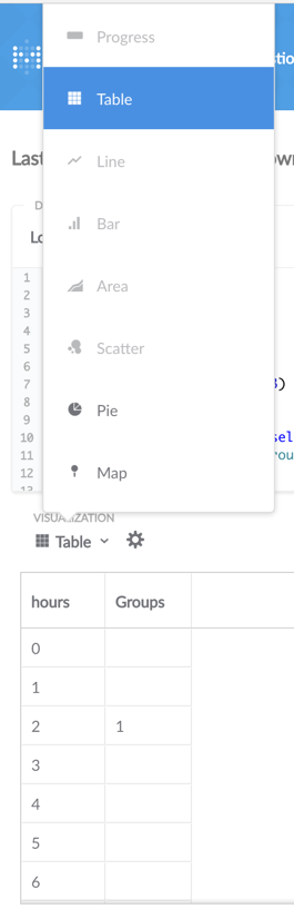
Yes I can click Bar (didn’t realise that, cheers). When I do, Metabase says “Please select columns for the X and Y axis in the chart settings.” Both columns consist of integers, but Metabase lets me assign only one of them to the Y axis (‘hours’).
Oops — just figured it out. The column I wanted to be on the Y axis (‘groups’) contained some null values. When I used coalesce(groups, 0) to turn nulls into 0s, Metabase was happy to chart it.
Cool, sorry again for the confusion. I think the null values thing is getting fixed in 0.21, which should be coming out imminently. And we’ll definitely need to look at the UX for the visualization dropdown. Thanks for the feedback!
I  Metabase