Hi there!
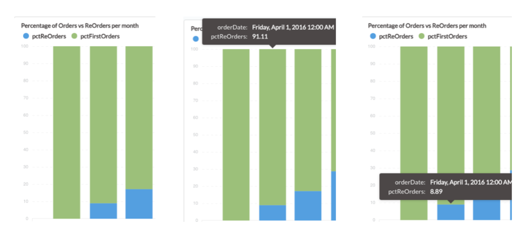
I noticed that the tooltips which appear when hovering over e.g. a column in a chart don't show the correct series name.
Instead, for all columns (which represent different data series) the values are labeled with the same series name, which should be different for each column (the values displayed in the tooltips are correct though)
See below: the green series should be called pctFirstOrders - the middle screenshot shows pctReOrders though.
Metabase Version: v0.20.0
Built on 2016-10-11
Same behavior on v0.20.3
Built on 2016-10-26
This problem applies to both stacked and grouped column charts.
Other chart types also don't really display the series name but instead only the metric name(s)... which is not nice, but at least not incorrect as for the column charts.