Hi everyone,
First, I'd like to thank Metabase for providing the open-source community such an useful tool. As a software developer I've been using it in the last 3 companies I've worked at, and it is a very popular internal tool.
Regarding the recently changed subscriptions and alerts, I'm sure you have put a lot of thought and effort in this change, and that you balanced the pros and cons. With that in mind, I'd like to add a small feedback regarding how text is displayed in pulses.
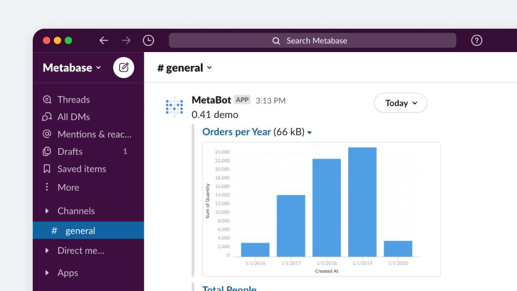
Looking at this screenshot you've shared in the Github release page, we can see that:
- There are no numbers on top of each bar;
- The font that appears in the axis is quite small
Taking into account accessibility for people that don't see so well, and that the pulse is seen through a smaller image than what would appear in the browser, would it be feasible to make the fonts larger in this case? Maybe we could have less values in the vertical axis, with steps of 5k or 10k instead of 2k (with the data from the screenshot below)
Best regards,
Giovanni