If I have 2 or more questions on a dashboard, each displayed as a chart with a timeseries x axis, does anyone know if its possible to ‘link’ the x- axis range on each chart so they all display the same range and allow temporal comparison between the displayed data?
Hi Brian, I have created a lot of dashboards already and never seen that this is possible (unless you do some code magic in the background I suppose …).
Totally agree - same that I would like to have filters not ONLY on dashboard level but having question filters that you could use for single questions within a dashboard …
I think it’s possible (both linking x-axis time windows across multiple questions in a dashboard and having a filter only affect ONE question on the dashboard)
All it depends on is you define a filter on your dashboard linked to a x-axis timeseries field and use that to control your question(s).
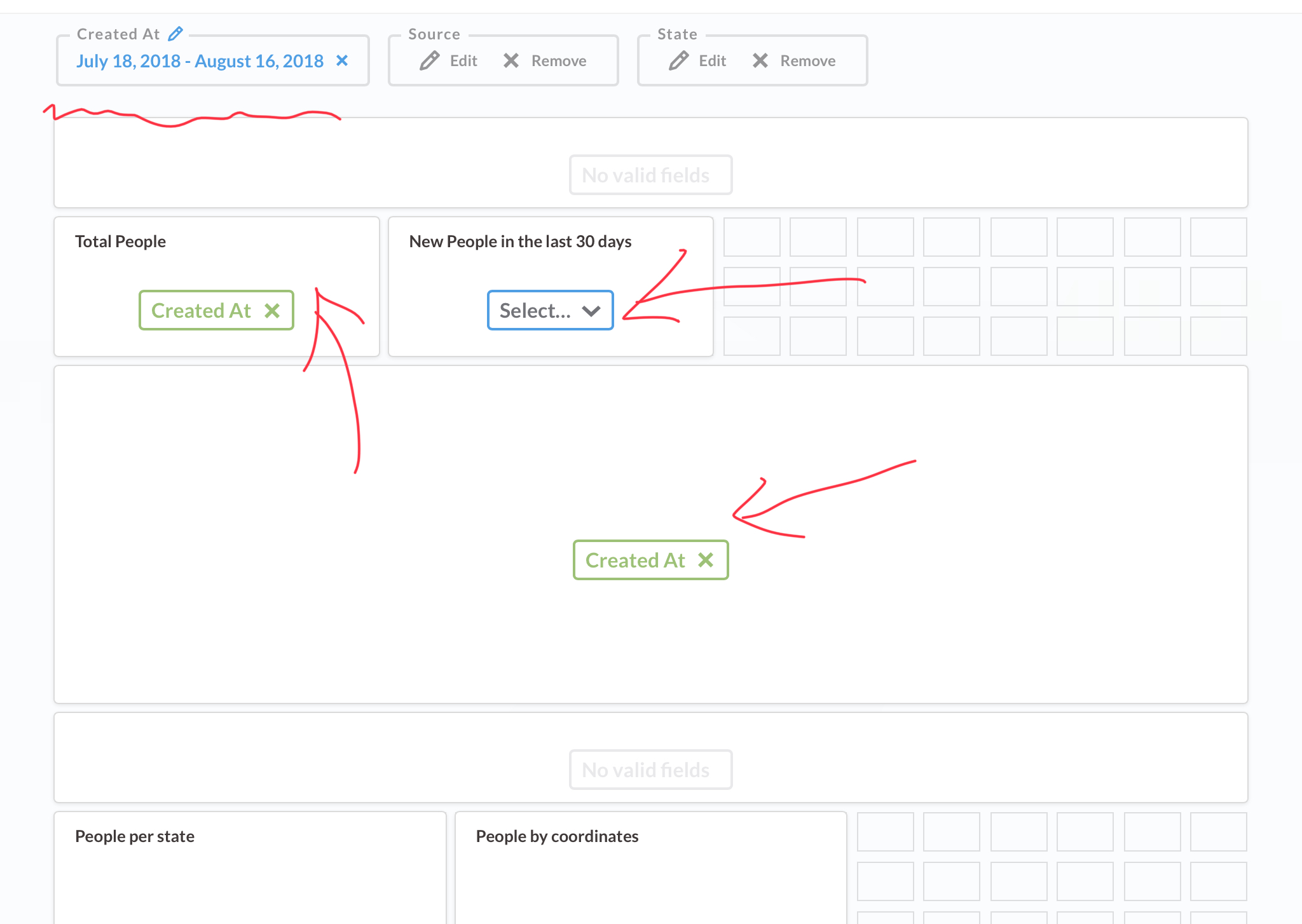
In the image below I just used the ‘A look at your People table’ automagically generated dashboard in the Sample Dataset of a fresh install. I then went into Dashboard edit mode and selected the created at filter. I changed it to a between filter but I would expect it to work for a previous period filter as well. Then it’s possible to select or remove the link to time window fields for questions. You can se I removed the link to the ‘New People I the last 30 days’ so it’s not controlled by the filter any more.
After I took the screenshot I saved the dashboard. Created a new question displaying total Orders by month shown as a line graph. I could then add it to the dashboard and link to the order dates. So, I think the foundation is there.
Oh, one last thing, @brianwilson you mentioned “combo” charts. If you’re referring to combining multiple questions in one chart there are some possibilities as well see Redirecting…
Thank you @jornh I was able to approximate something based on the multiseries link. Not perfect but may work for now. I was hoping to be able to render charts as “tracks” on a temporal dashboard. I can fake it some what with the multiseries but would be nice to have a way to “link” the x-axis scale of independent questions that have a time component. thanks again.
Hi @brianwilson, Can you share how you used multiseries to solve your requirement.
I have timeseries data with prices for 4 securities. Would like to show comparative price movements across 2 securities.
I created 2 identical questions (say A and B), hoping that in A i can select Security 1 and in B Security 2. However on dashboard, after adding A, B does not come up for selection.
Sorry @Krishna That was a few versions ago. With the more recent version of metabase I’ve found this functionality flakey (Multi Series charts conflicting behaviour) I havent had time to delve into what might be happening and resorted to writing native SQL in the short term.
Using native SQL - are you saying that you have written single query with multiple dimensions. Then through single question you are able to build a multi-series chart ?