Dynamic column names require Dynamic SQL programming techniques, which is not something you can do from Metabase easily. Instead of making the periods columns, pivot the month columns into rows, where you can control the category name. The bar chart will create the breakout based on the category column. The breakout is calculated when the chart is rendered. The only thing that might change is the colors for the columns, as the charts remember previous series and assign new colors for new series.
For example, I’m using this query (a little more complicated to produce the desired output, but the key part is that to_char() call):
with cte as (
select remote_addr,
  date_trunc('month', request_time) as mo,
  sum(body_byte_sent) as total_bytes
  from accesslog group by 1,2 order by 1,2
)

select remote_addr,
  to_char(mo, 'Month') as month,
  total_bytes
  from cte
  where remote_addr in (
    select remote_addr from cte where remote_addr << '2a03:2880:3ff::/48'
    group by 1 having count(*) = 3
  )
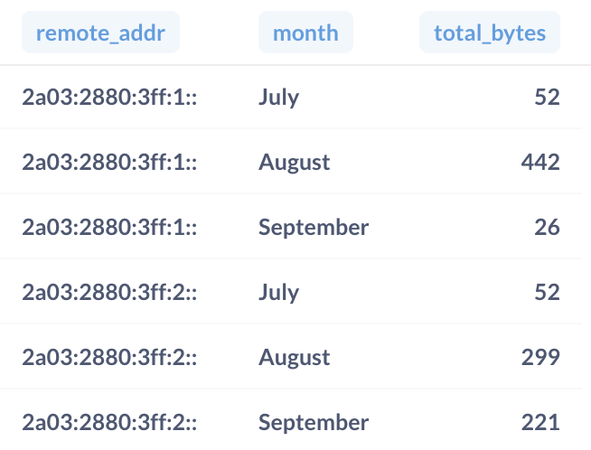
The query outputs this:
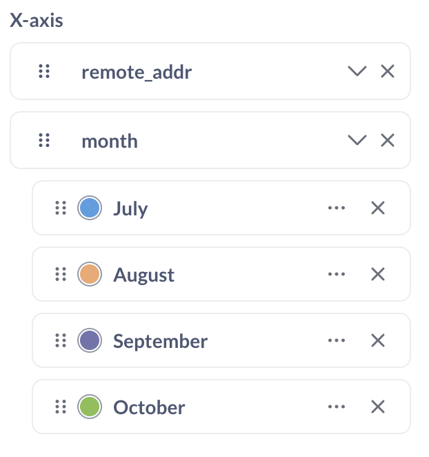
When you plot it, use the category column as your breakout:
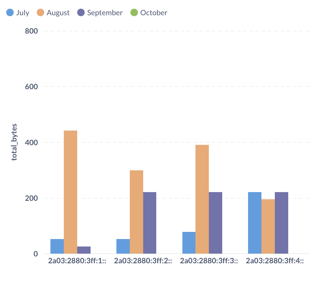
Now your charts will have the series labeled by date.
(Editor’s note: IPv6 addresses are from Facebook URL validators, they’re public addresses.)
EDIT: Oops, didn’t notice it was sorting by month name. Fixed it.