I have a simple line chart that shows me the number of records per day. It just provides a simple check that my DW load is working correctly.
In a dashboard, it looks like this:
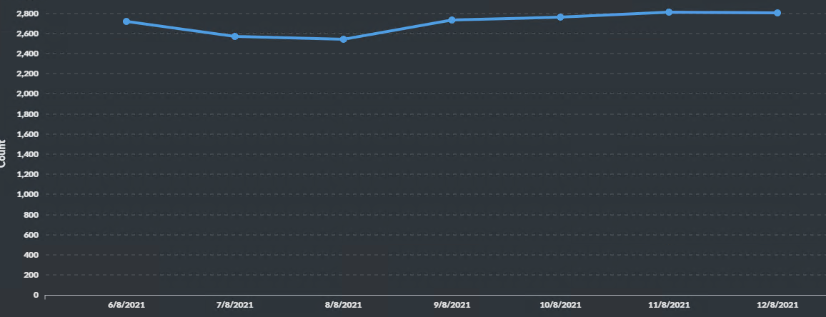
which is useful.
I setup a daily alert. It looks like this:
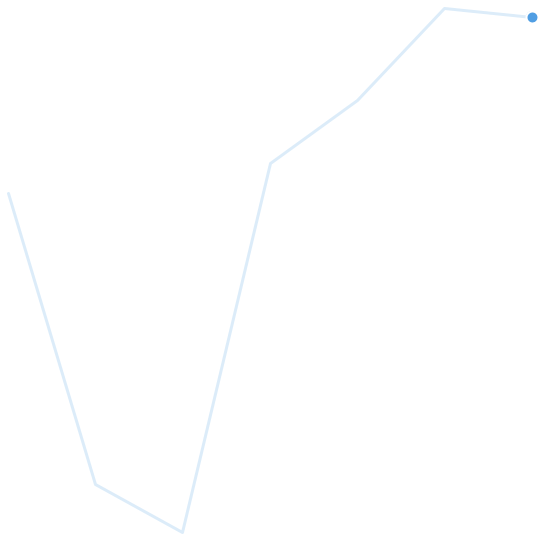
Which is no use to man nor beast.
I assume it's ignoring the zero axis and just showing the changes.
Other than changing it to be a simple table, any thoughts on what I can do to fix?