Is there a way to trick Row visualizations into doing some conditional formatting?
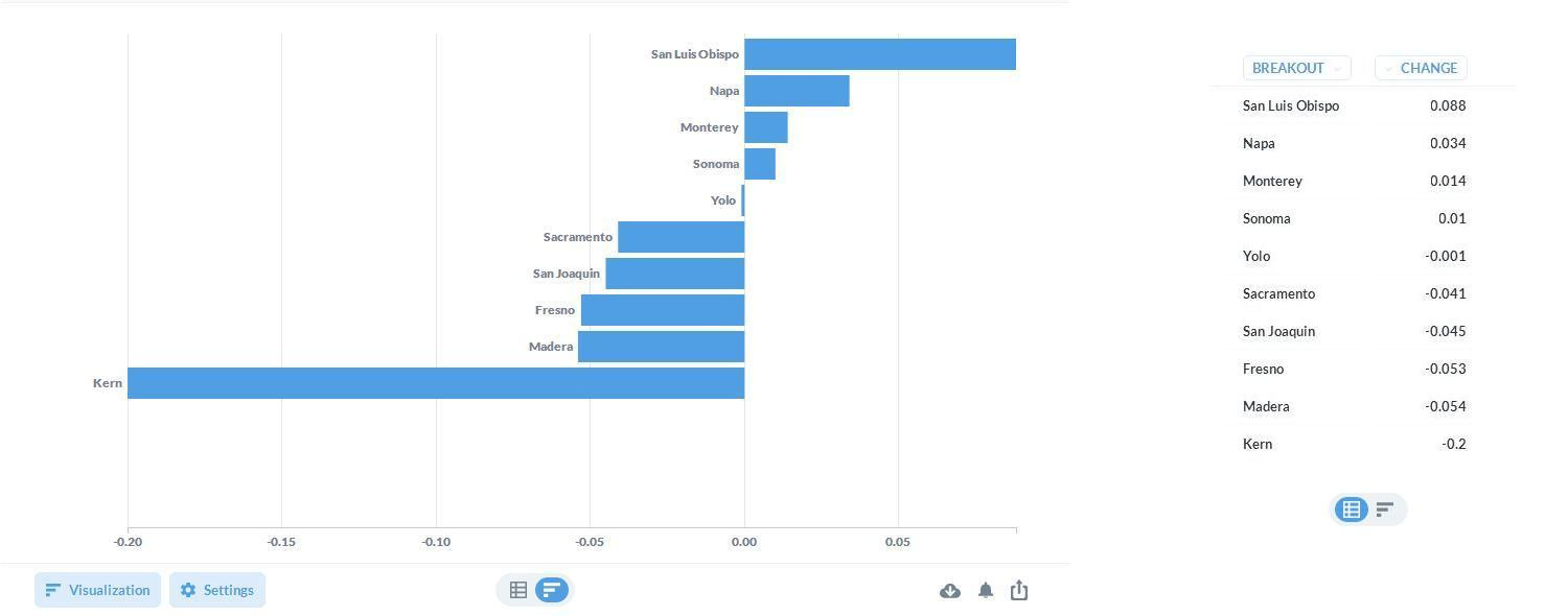
Bar visualizations take a little sql trickery to squeeze out some basic conditional formatting. But with Row visualizations there's just no wiggle room. Not even the x-axis is format-able.
Bars can make use of different series to give the illusion of conditional formatting:

Rows don't even allow that and what comes out is this yucky looking thing:
Is there any way of making a swan out of this ugly duckling?
v0.35.3