Hello,
Having a little unexpected behavior with visualization tooltips, in particular, the way fields are displayed in the tooltips when using native SQL queries.
First issue is an overall problem: I can't figure out how to have "human readable" column names in the tooltip. This behavior happens in spite of renaming the columns in Settings > Display for the visualization except for the column I'm currently hovering.
Here is a couple pictures to demonstrate - I hover one series and the column name displays properly for that series only:
And when I hover the next series, it displays properly for that one:

When you hover over a different series, the human readable name comes through for the hovered series only.
This is only true for data that is pre-pivoted by my query, with a tabular output similar to:
       | volume |   count |
---------------------------
week 1 | 123.45 |  67,891 |
week 2 | 234.56 |  78,912 |
week 3 | 345.67 |  89,123 |
If the data is not already pivoted by my query, i.e.:
       |   type |  amount |
---------------------------
week 1 | volume |  123.45 |
week 1 |  count |  67,891 |
week 2 | volume |  234.56 |
week 2 |  count |  78,912 |
week 3 | volume |  345.67 |
week 3 |  count |  89,123 |
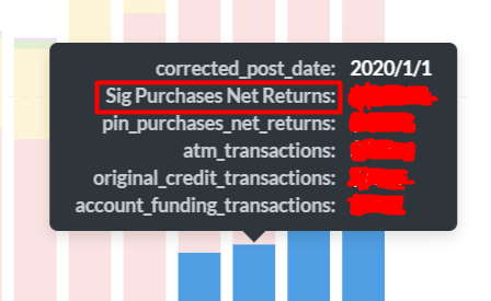
The tooltip behavior changes so that it doesn't show any of the other series' in the visualization, only the hovered one:

So I would like to know:
- How I get the "human readable" column names to consistently appear in the tooltips
- If there is any sort of advanced behavior control over the tooltips, like:
a. Controlling which series' do or don't appear
b. Showing a summary (e.g. column or row total)
c. Showing related data from another column (e.g., visualization is showing purchase volume, additional data in tooltip is showing transaction count)
I really would like to get (1) fixed, and (2) would be nice to have/I can make a feature request for it.
Thank you!