Hello.
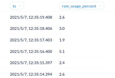
I have a table of cpu_usage_percent vs timestamp.
I am unable to visualise this is a bar chart, line chart or something useful. Any idea why?
Hello.
I have a table of cpu_usage_percent vs timestamp.
I am unable to visualise this is a bar chart, line chart or something useful. Any idea why?
Holy crap this is a bit embarrassing. Thanks very much for the prompt response. Really appreciate it.
@kartikynwa That being said, Metabase will only display 2000 points, so if you're expecting to view across a long period, then you would have to change the granularity - or use a different tool.
Great point. Thanks.