Axis label based on filter selection

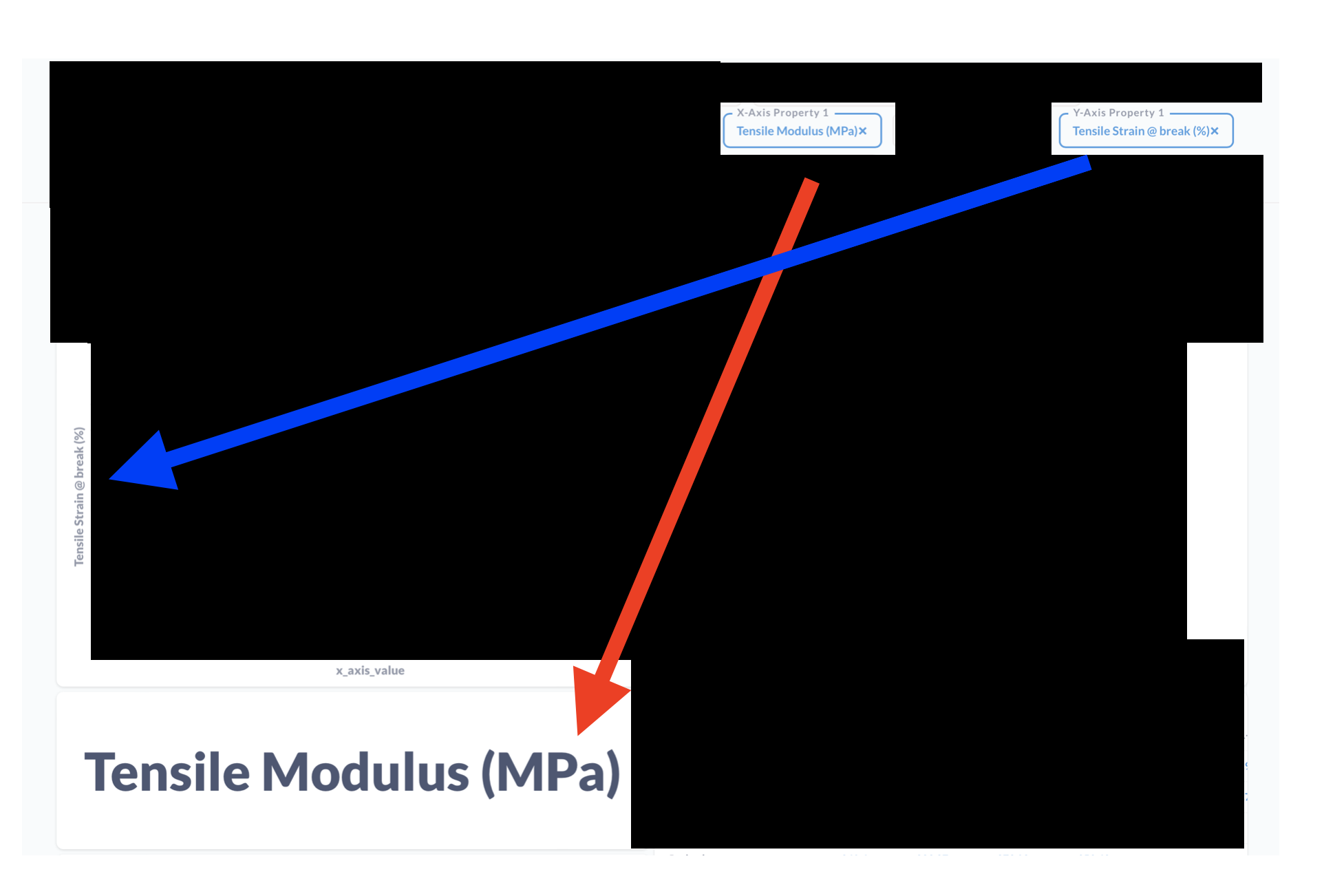
I created a "graph builder" for our team. We often want to create graphs with different X-axis and Y-axis properties, so I created a question where the user can select the properties that is shown along each axis. The problem I'm running into is that by setting a series breakout Metabase automatically detects the type of the data and labels the Y-axis automatically. But the X-axis label remains static.

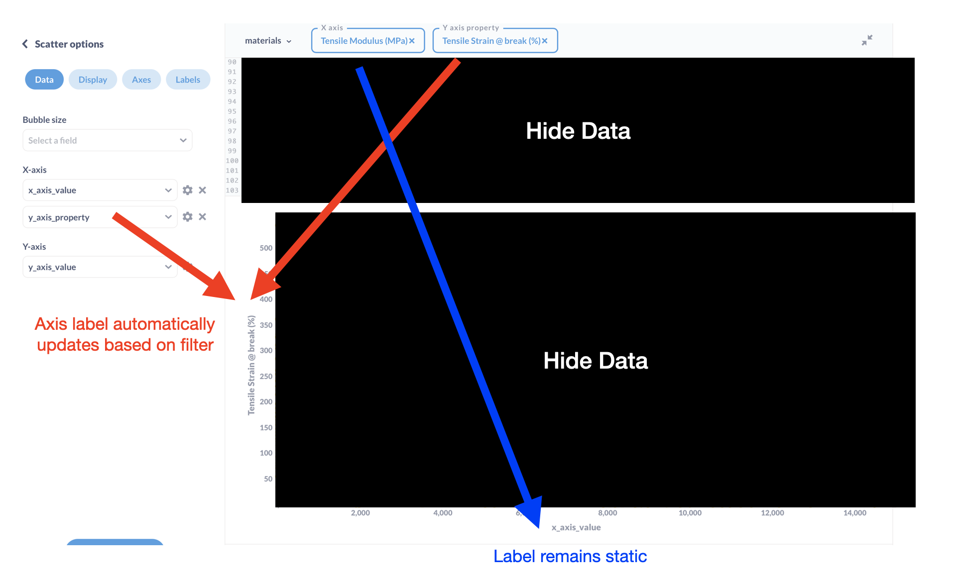
I would like for the X-axis label to automatically update based on the filter selected. In this specific example I would like the X-axis label to have automatically updated to Tensile Modulus (MPa).

Is there anyway to do this? Whether via a clever SQL hack or through the UI?

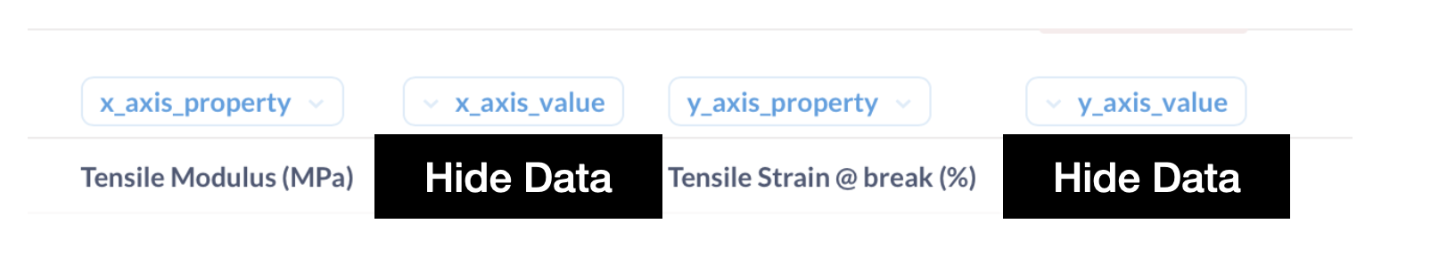
The raw data looks something like this before I throw it into the plot.

Hi @jeffDeon
The way labels are connected in the visualization_settings (question metadata), then you would likely not be able to change the column name via SQL without it messing up the visualization.
I would probably hide the axis labels under Labels to avoid confusion.

In theory I could also "brute force" the solution by just adding a new question that just displays the label of the filter. So something like this.

But now the issue is that text boxes are WAY bigger than what I want. It seems like the minimum height of a question in a dashboard is 3 squares. Is there anyway to make text boxes smaller than 3 grid squares?

@jeffDeon You can use Textbox with filter value on newer versions:
https://www.metabase.com/docs/latest/dashboards/introduction#including-variables-in-text-cards