We have a chart that summarizes data by hour of day created through a custom question. The axis labels should just show 12AM, 1AM, 2AM, 3AM, 4AM, etc, but instead they show the full datetime, using the day before whatever day I happen to be viewing the chart on. For example, today it It reads May 20, 2020, 12: AM,May 20, 2020, 1:00 AM, etc.
This happens when I'm using the custom question editor to summarize a column by "datetime: Hour of day" - where datatime is the name of one of the columns on our table. It appears that "Hour of Day" is the only one that behaves like this. If I choose any other option to summarize by, such as Minute of hour, Day of week, ... Quarter of Year, then the axis labels display as expected.
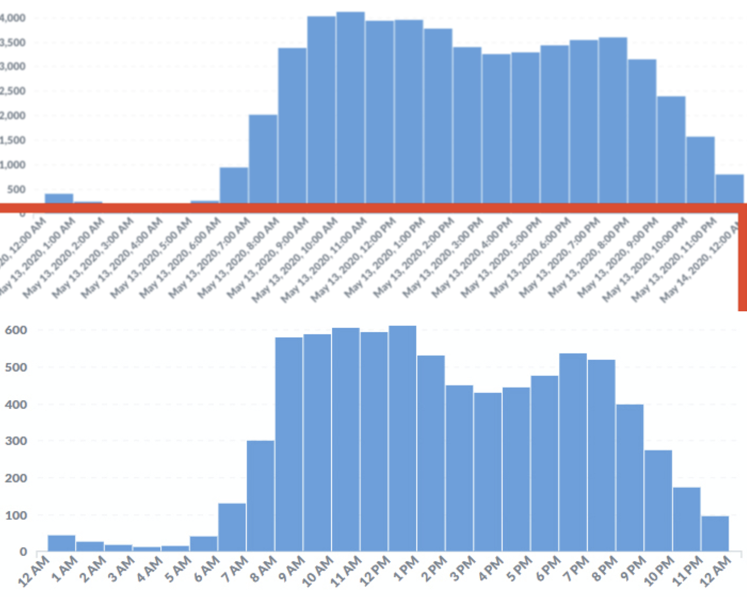
The attached screenshot shows two copies of the chart in question, one as it looked sometime last year, and one as looked a week ago. Aside from the numbers and the dates, the chart still looks like that now.
@randy
So you’re using a DateTime column as the Primary Key for your table?
There’s a handful of issues open about that, so that’s probably causing some problems.
If you set the Field Type to “Creation timestamp”, then it should display correctly.
I changed it, so now it looks better in the individual question*, but in the dashboard that uses the question, it is still showing the full datetimes.
* but still not the same. In the old graph, it shows just the hour number, but now it includes the minutes as well, so I see 1:00 PM, 2:00 PM, 3:00 PM, etc. instead of 1 PM, 2 PM, 3 PM, etc.