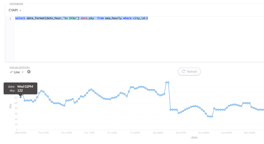
I have a query that returns this data:
Wed 02PM 35
Wed 03PM 50
Wed 04PM 32
Wed 05PM 35
Wed 06PM 37
Wed 07PM 38
Wed 08PM 28
Wed 09PM 30
Wed 10PM 39
Wed 11PM 52
Thu 12AM 61
Thu 01AM 59
Thu 02AM 51
Thu 03AM 46
Thu 04AM 37
Thu 05AM 31
Thu 06AM 28
Thu 07AM 30
Thu 08AM 34
Thu 09AM 34
Thu 10AM 33
Thu 11AM 33
Thu 12PM 34
Thu 01PM 35
......
...
In this case 20 is plotted as 112, strange thing is after some rows data is ok. check the chart after Sat those are good, the data is values less or equal to 100 since are Percentage.
thanks...