Hi there!
I have a bar chart that can display up to 13 options. However, in many cases only part of these options have results on the chart. So the 13 options "pollute" my graph and I would like only the options with results to appear.
Examples:
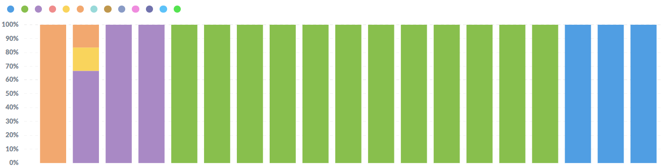
I have this result:
showing all 13 options
showing all 13 options
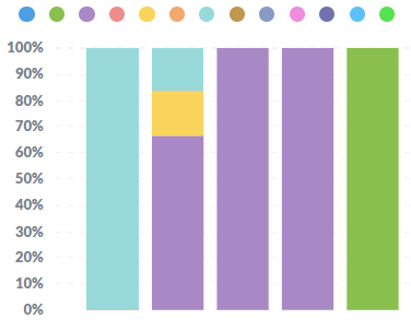
And I want this result (I edited these images to what I want):
Showing only the 7 options that exists
Showing only the 6 options that exists
Is there any way to do this? or do i always need my 13 options? consider that my query dynamically returns only columns with results - that is, when there are no results there are no columns in the table that metabase reads.
Thanks in advance 
Hi @Helena
Unless I'm misunderstanding your data, you don't have multiple columns - the dataset should only return 3 columns to show a graph like that - X-axis and breakout, and Y-axis.
The problem is that you are likely returning rows even though the value is null or 0 (zero).
Simply just filter out those zero rows after the aggregation.
1 Like
Hi, @flamber. Thanks for your reply.
To build a stacked chart I needed to make one column for each scale (ie, 13 columns).
So, the dataset I'm using has:
x-axis: 1 column of information
y-axis: 13 columns of information
What happens is that in fact the dataset has null values, but they are null integer columns and not null integer rows.
I can redo my dataset to show this information in rows, instead of columns. But then I don't know how I would plot the stacked bar graph. I thought that to build this graph, I would need a column for each stacked variable - so I made the y-axis have 13 variables(columns).
@Helena Okay, that makes sense. It's difficult to understand people's datasets from just a screenshot.
You would kinda need to reverse-pivot - depending on your database type and how you generally make questions that might be easy-ish for you.
It should then go into a 3 column format like this:
X-axis | X-breakout | Y-axis
1 Like
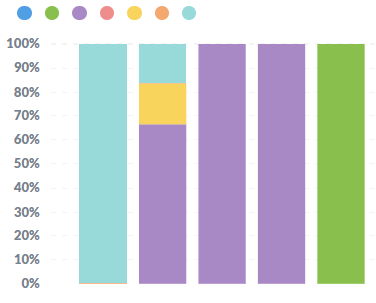
I understood what you meant! in my mind, metabase needed columns to plot the stacked bar graph. But I built the dataset the way you told me and it worked  Thank you very much, the graph is now beautiful.
@Helena Post a screenshot, so we can see all the glory 
1 Like
For sure
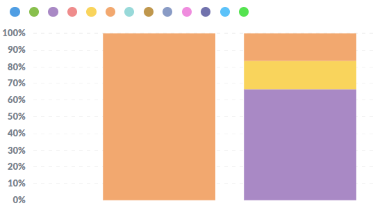
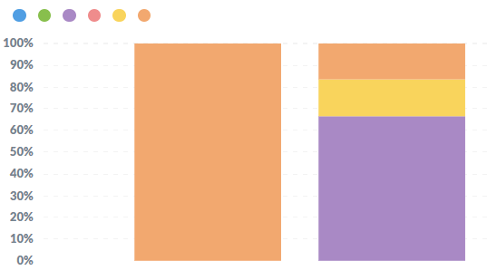
Before:
After the mdification:
The order change a little, but still great.
1 Like