Hello, I want to create bar charts which shows the percentage on the bars, as such now I can only see counts of values, I want to change it to percentage. Pls help. I can see percentage in stacked bar charts but not in the normal bar chart. Please reply soon.
Hi @akashchaudhary365
Then you would use a Custom Expression to return the percentage instead of the count.
Like: 100 / Count * Distinct([your_column])
https://www.metabase.com/learn/questions/custom-expressions
I want the count in percentages, means count / total value *100 should give us the count in percentages, But when we do this it keeps the total value same in all the values, As total in all the values will be different. Pls help...
@akashchaudhary365 I don't understand.
- Post "Diagnostic Info" from Admin > Troubleshooting
- Post screenshots of your problem and what you are trying to do.
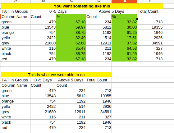
We want to do the highligted part. We were able to do the below. Please help. We cannot share the metabase screenshot as it goes beyond our official Terms. Thank you and please help!
@akashchaudhary365
Use Custom Expression to create the three metrics you want plus the percentages.
CountIf(interval([Created At], -5, "day")) as "Last 5 days"
CountIf(interval([Created At], -5, "day")) / Count as "Last 5 days %"
Count - CountIf(interval([Created At], -5, "day")) as "Above 5 days"
(Count - CountIf(interval([Created At], -5, "day"))) / Count as "Above 5 days %"
Count as "Total count"
And grouped by whatever column the color names are supposed to represent.
I got your point. But the column "0-5 Days" is a character and all the values in it has "0-5 Days" and same is the case with "Above 5 Days", Whereas the interval function takes a Number in the syntax, In our case the number is a Character which is "0-5 Days". Please help in this one.
@akashchaudhary365 I don't understand, so post sample data.