Right now there are 2 things that we use as alternative, but it’s still unsatisfying
Using offset / lag so we can calculate it, then use Bar x Line chart. Cons: the increase and decrease is based on the value of % increase, so the line can going down when the bar actually goes up, in case of the growth not as good as previous year
Using hover to show the +xx%, but it’s too much of a hassle
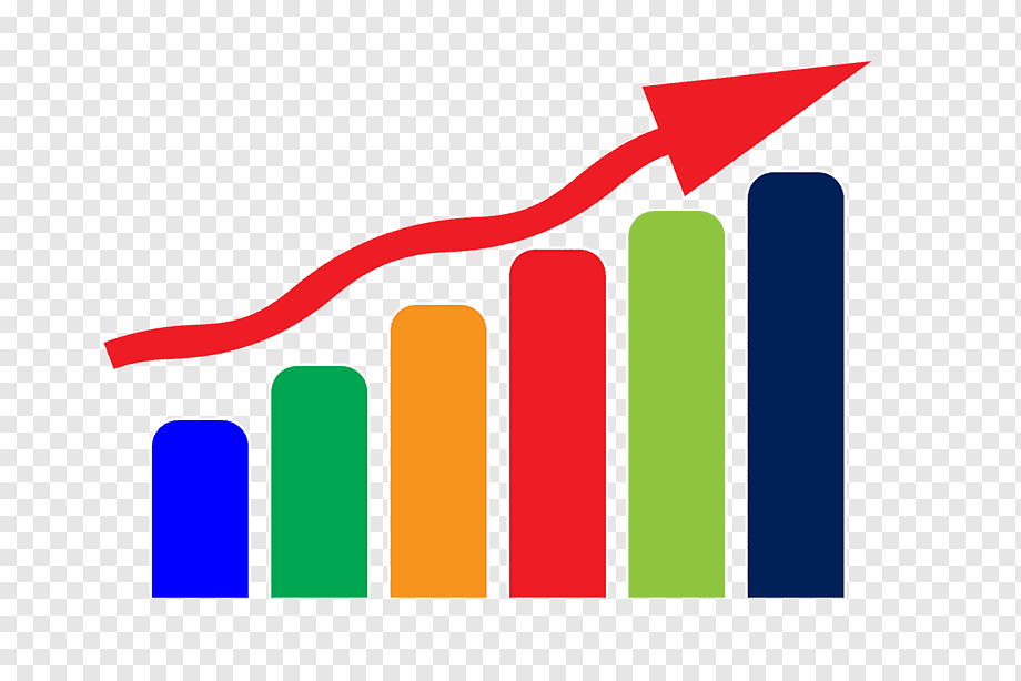
This kind of chart is good to visualize our increase more intuitively
As you found, you can use a combo chart to plot bars and lines on the same chart. In addition to changing the visualization type per-series, you can write separate questions to generate the bar and line series and combine them in a dashboard visualization. This can help with queries that need one series aggregated while a second is unaggregated.
What behavior are you looking for here? Sounds like its working as designed.
Metabase doesn’t have the ability to plot one series and use another for labels. You can include the % change in the tooltip, though Metabase usually calculates this for you automatically. If you need to highlight delta change then try inverting your visualization – plot your metric as a line and the % change as a bar.