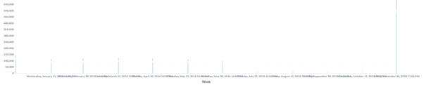
Data that is grouped by week - using FORMAT_DATE("%Y-%V", DATE(timestamp)) in BigQuery standard SQL - is displayed in a bar chart (or line chart) like this:
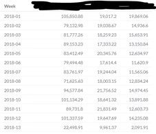
The underlying figures and the grouping are ok though, if switched to table format everything looks fine, also the week numbers:
Any suggested solution? This seems to be a bug in how the chart interprets and groups the week numbers, rather as month than week.
Looks like you get bitten by that Metabase is “clever” and sees it’s a date type so it displays the time dimension as dates - in Metabases standard date format. (Americans don’t care much for week numbers). Maybe as a work-around you can cast it to a text type?
Improvements for the X axis labels have been added to the next upcoming major release 0.29 wheneven it’s ready:
Added to corresponding github issue #7236, apparently it’s regular numbers too not just dates that can be interpreted by Metabase as a regular date. Concatenating a special character at the beginning of the category label solved the problem in this particular case.