My sample data (entirely fictional) has 4 columns
course_name (string) | credits_available (1-5 int) | ease_to_score_marks_rating (1-100 range float) | girls_to_boys_ratio (percentage float)
Now, assuming I want to maximize my credits while having a chill and enjoyable acads environment, I would love to draw a bubble chart based on above data.
x-axis - girls_to_boys_ratio (higher the better - enjoyable)
y-axis - ease_to_score_marks_rating (higher the better - chill)
I am able to draw the graph as expected. But there are some things I would like to improve on.
a. Primary pain point - Each bubble should have course_name variable when I hover on it (otherwise whole point of this particular visualization exercise is lost)
b. I should have a setting where I can set bubble base size (depending on my data size sometimes the view gets too cramped - I would like to set my bubbles with smaller size in such cases)
c. This particular request I observed while bubble plot, but is actually applicable in other scenarios as well. If you guys can provide an opacity filter, that would be absolutely amazing.
Please feel free to rename the topic accordingly. I am not so proud of myself with the current one. Keep the amazing updates coming. Cheers,
Argo
Thanks for the feedback, Argo. Point A is an excellent catch IMHO. I created an issue for this on GitHub.
For point B, we tried to pick a sensible default size, and a scale to make the relative sizes between bubbles make sense, but I could see us possibly adding an input box under the chart settings. If you feel strongly about this feature, we’d welcome a new github issue (or better yet, a pull request ).
Can you tell me a little bit more about what you’re looking for in what you described under point C? Do you mean a filter that determines the relative opacity of a bubble based on a value? Not totally clear what you’re describing.
Thanks for the quick response.
Also, great job articulating my thoughts in a cogent, more readable manner.
Regarding point C - the particular behavior requirement you have mentioned in here, it already exists. And it's a bit twitchy for sure.
What I was asking was more straightforward. You guys already provide a color palette under Display options for all charts/graphs. If you can provide an additional opacity filter also, that would be helpful for visualizing data where we have one category overlaying on another.
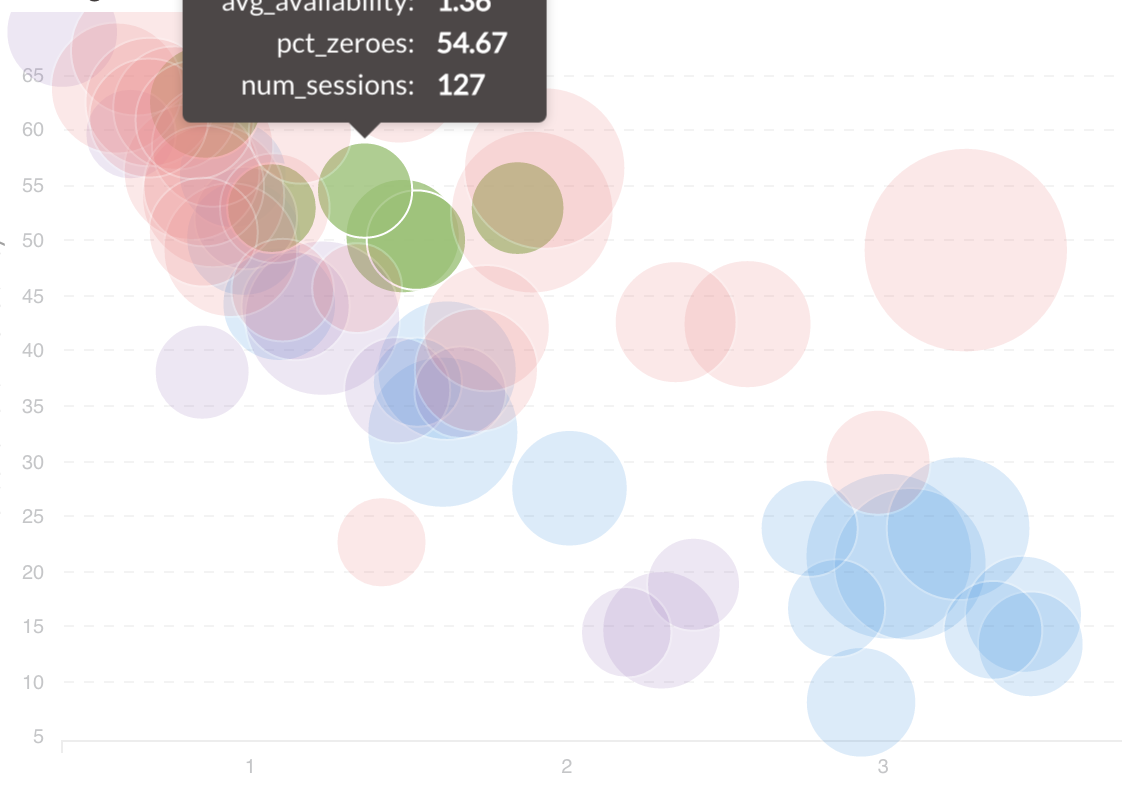
Now, the size requirement, mentioned in point B is required because some bubbles (the green bubble to the left of tooltip marked bubble in attached image) are completely enbubbled (yay, new word ) by others and not at all clickable unless you bloat the plot to disproportionate size. I think that's because we are presently playing only with the opacity and not pulling the selected color bubbles to the front of the page. But this problem is probably better served by hiding (rather than playing with opacity and ending up with a flickery graph) all other color bubbles when clicked on any one color.
 Keep the amazing updates coming. Cheers,
 ).
).