Is it possible to configure a same line chart so that it changes depending on the date (year, moth, days, hours) selected in the filter?
Or i need to add separate line graphs to filter by year, month, day, hour?
Metabase will display the data you are fetching. If you are fetching just 1 value then metabase will plot 1 value. You will need to include all the other monthly values and set the amount to 0
Thanks for your reply! I don't quite understand what value should be set to 0.
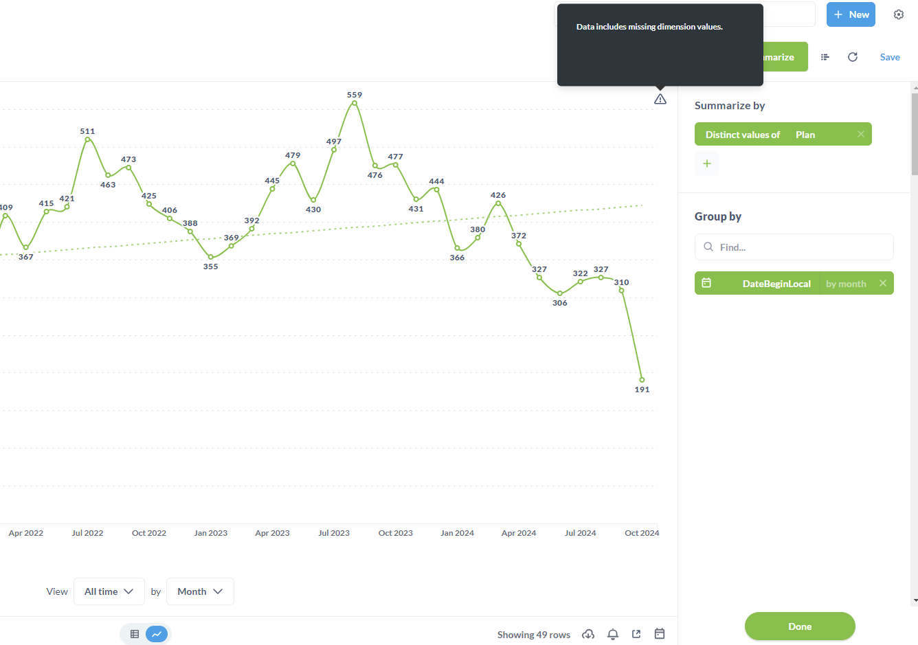
In my line chart, I set the group by month. But I can’t add a group by day etc using the same Date field.
I am not sure i understand the issue sorry, so you can either group by Month, Year, Day and so on ... If you are grouping by month and select that month then you get only the values for that month ... on the other hand you should be able to group by day and select the monthly range you need
Yes, I can choose to group by day instead of group by month.
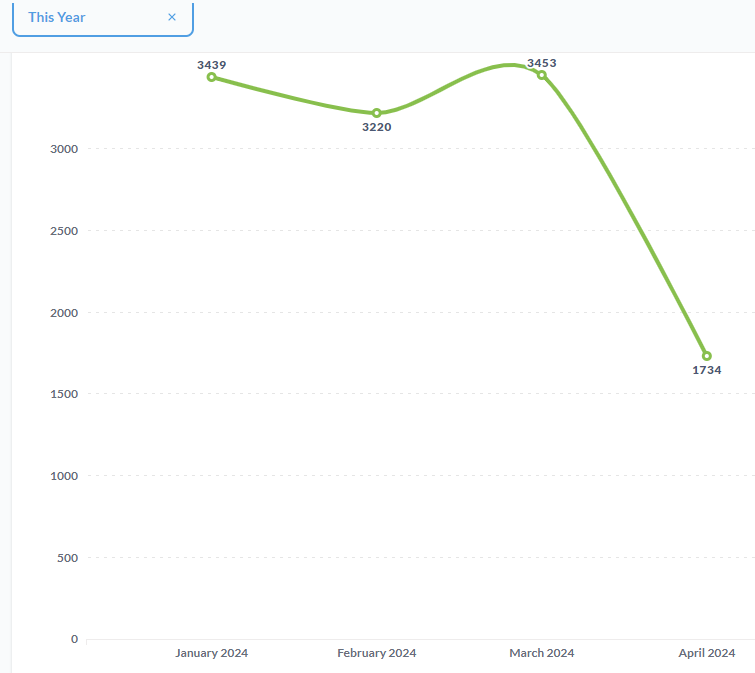
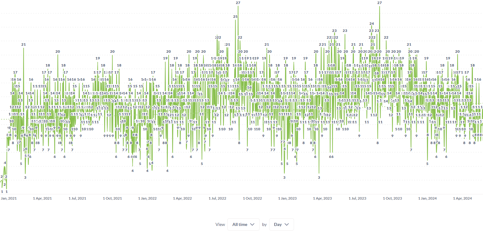
But in this case, when selected in the filter by date for the year, the line chart will be unreadable.
As far as I understand, it is not possible that when I select a year in the filter by date, the linear chart displays it by month.
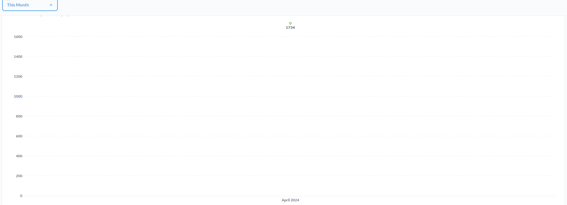
When I select a month in the date filter, the same linear chart displays it by day. And etc.
Like drill but using date filter in dashboard.
Thanks for the answer!
I think it would be a killer feature if the dashboard date filter had an effect on the line chart.
Because as I said earlier, if you select All time by Day, the line chart becomes unreadable if dashboard date filter set by years, also if I select Don't bin i get same result.
For example, in the line chart settings, I select All Time and Don't Bin and the line chart will adjust to the date intervals that are selected in the date filter in the dashboard.
And if I select one day in the date filter in the dashboard, the line chart shows by hour.
If I select a month or several days in the date filter in the dashboard, the line chart shows by day.
And etc.