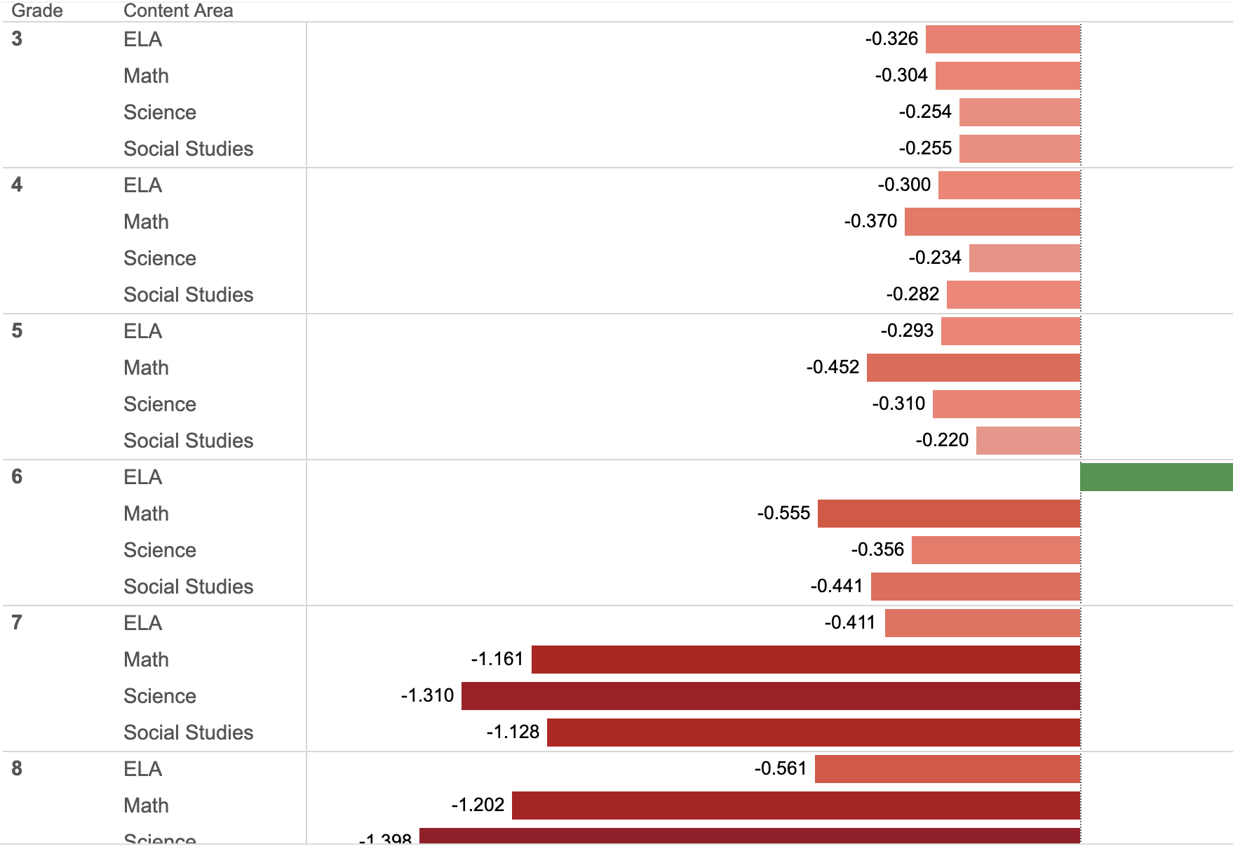
Hi, I'm trying to figure out how to produce something similar to this. Basically the groupings on the y-axis by grade and content area. Any ideas how to accomplish this (or something similar)?
Hi @tjmule
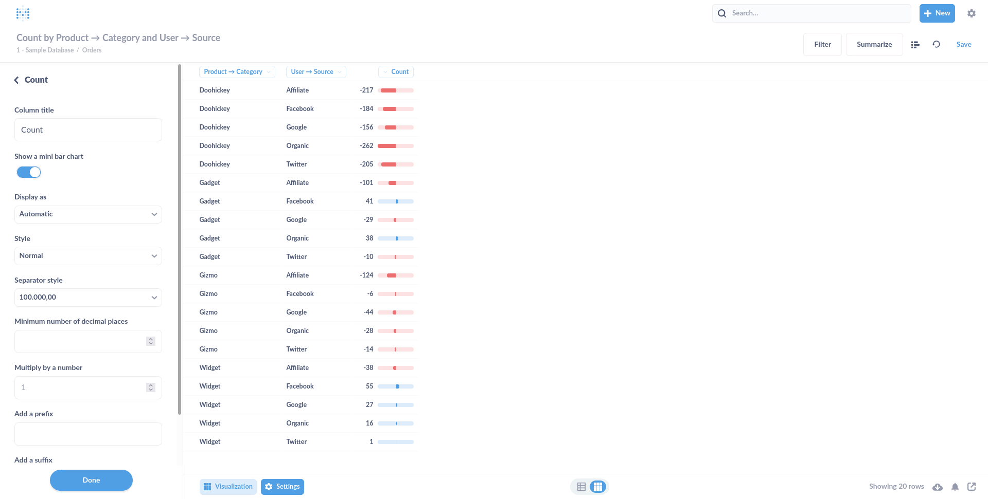
I think the closest you can get is something like this with "Show a mini bar chart":
It kinda looks like you are looking for Sparklines (or something close to that):
Visualization: Sparklines for Tables · Issue #10338 · metabase/metabase · GitHub - upvote by clicking ![]() on the first post
on the first post