ryo
February 12, 2026, 4:23pm
1
Hello,
I would like to create a bar chart I’m using Metabase cloud
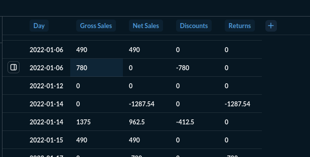
My table is simple
A date and 4 amounts
I would like to see those 4 amounts per day like this Create interactive charts | Metabase Learn
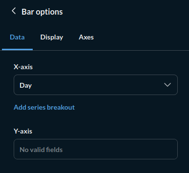
But the configuration is not working :
I cannot choose the Y-axis
So I follow what is suggested :
And tried multiple options;:
So I do not know how to use it
Can someone help me ?
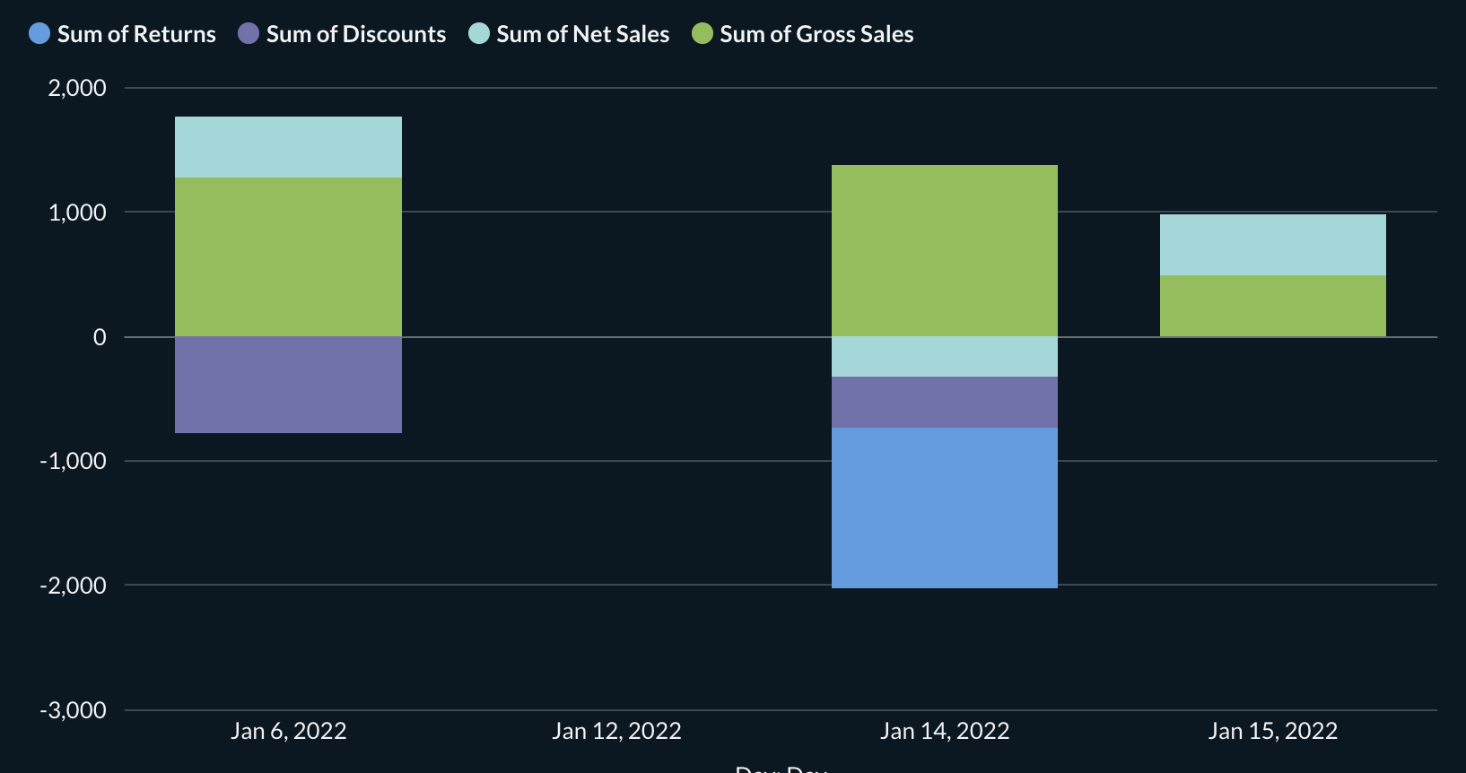
It’s a bit of a bizarre sales ledger, with the duplicated and missing days and all, so the chart won’t be pretty, but it’ll work.
I assume you are looking for a stacked bar chart? That’s what’s described on the page you linked.
To get a chart like this (note that days missing from the ledger are not represented here):
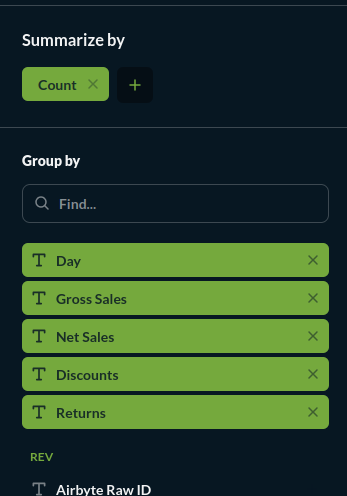
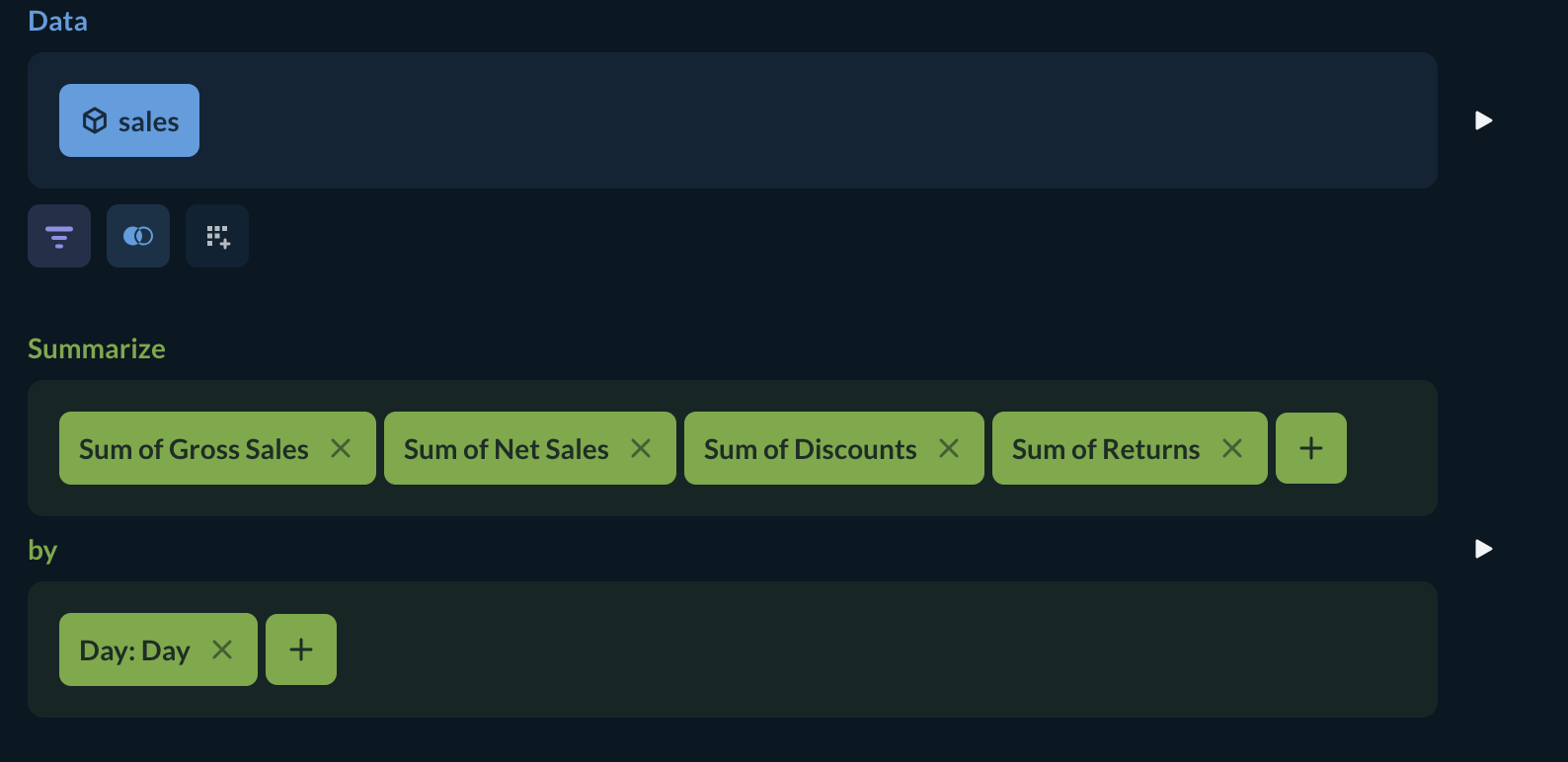
Set your notebook up like this:
You’ll get 4 different series, one for each column, summed for each day.
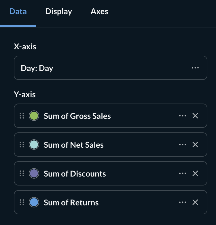
Select a Bar chart as your visualization.
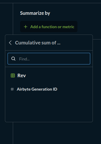
Set up the panels like this: (If the Y-axis has the wrong series, use the X button to delete it, then use ‘Add a series’ or ‘add a breakout’ to repopulate it)
You may want to omit the “Net Sales” column as the bar chart will represent that already.
Let us know if this isn’t what you were looking for.