Hi @Max1
Post "Diagnostic Info" from Admin > Troubleshooting.
One or more of the questions are returning a unix timestamp value (year 1970) somewhere.
You can likely fix it by changing from Timeseries to Ordinal in the visualization settings > Display > X-axis scale = Ordinal.
Hi @flamber
Thank you very much for your response!
It worked. That made it definitely much better.
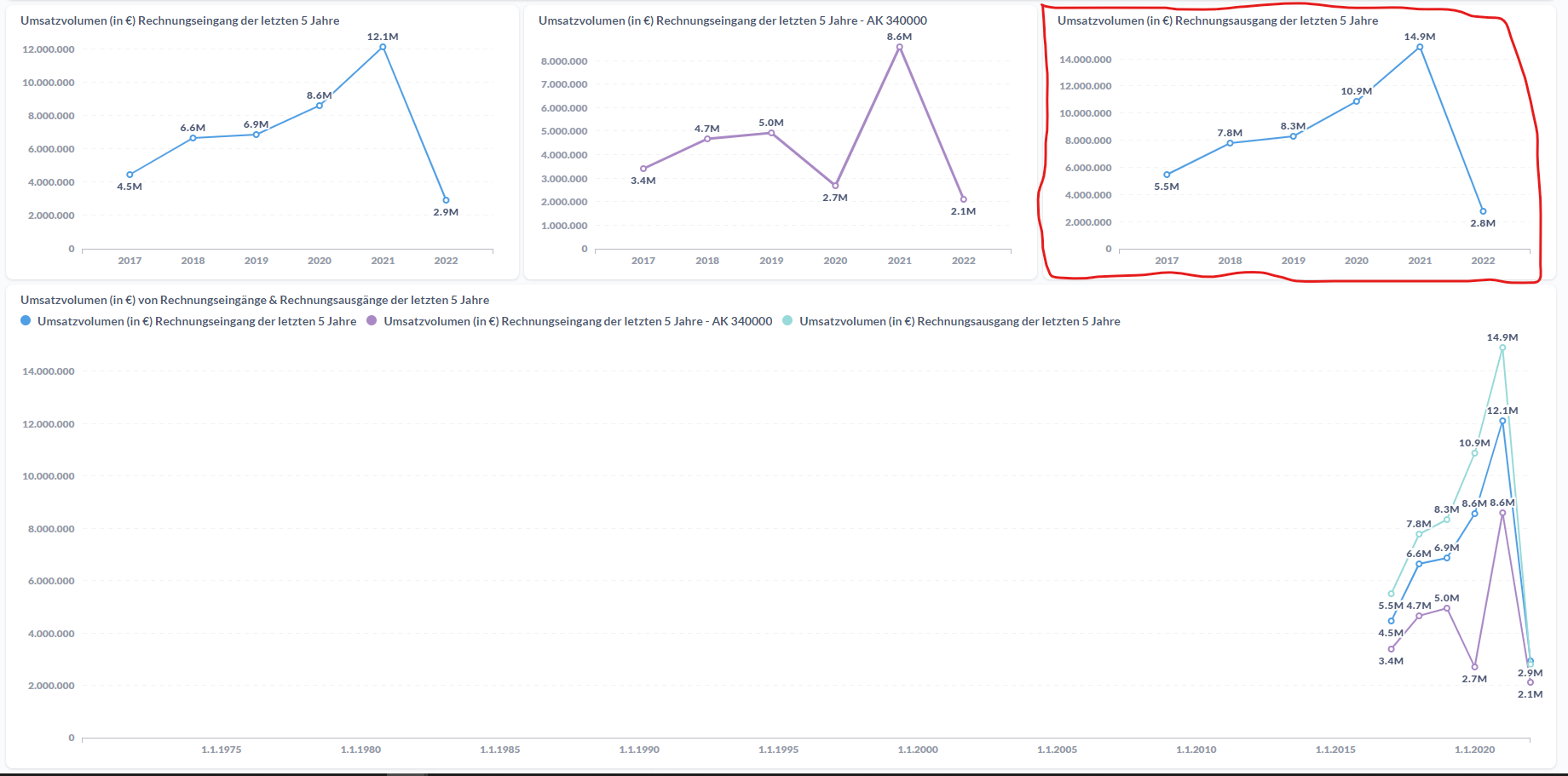
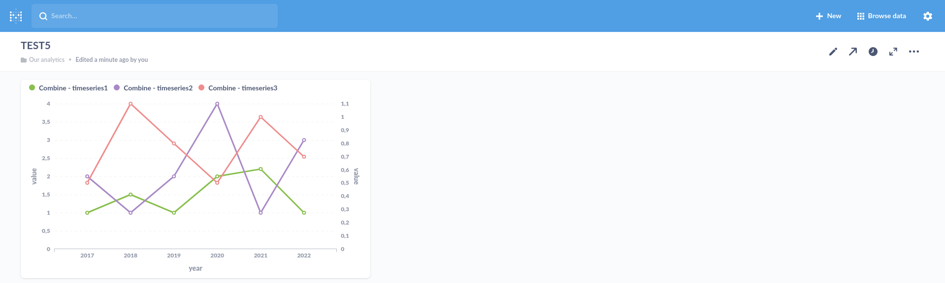
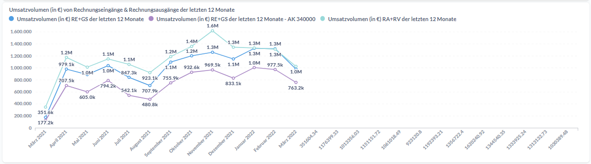
However, now it shows these random numbers on the right.
Do you have an idea on how to ditch those?
@Max1 One of your charts is actually including results that has these numbers. You would have to look at each question. Alternatively, you can filter out any data that is before 2000 or after today.
@flamber Thank you.
It is totaly possible, that my data includes some weird numbers which aren’t supposed to be there.
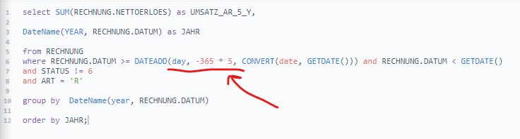
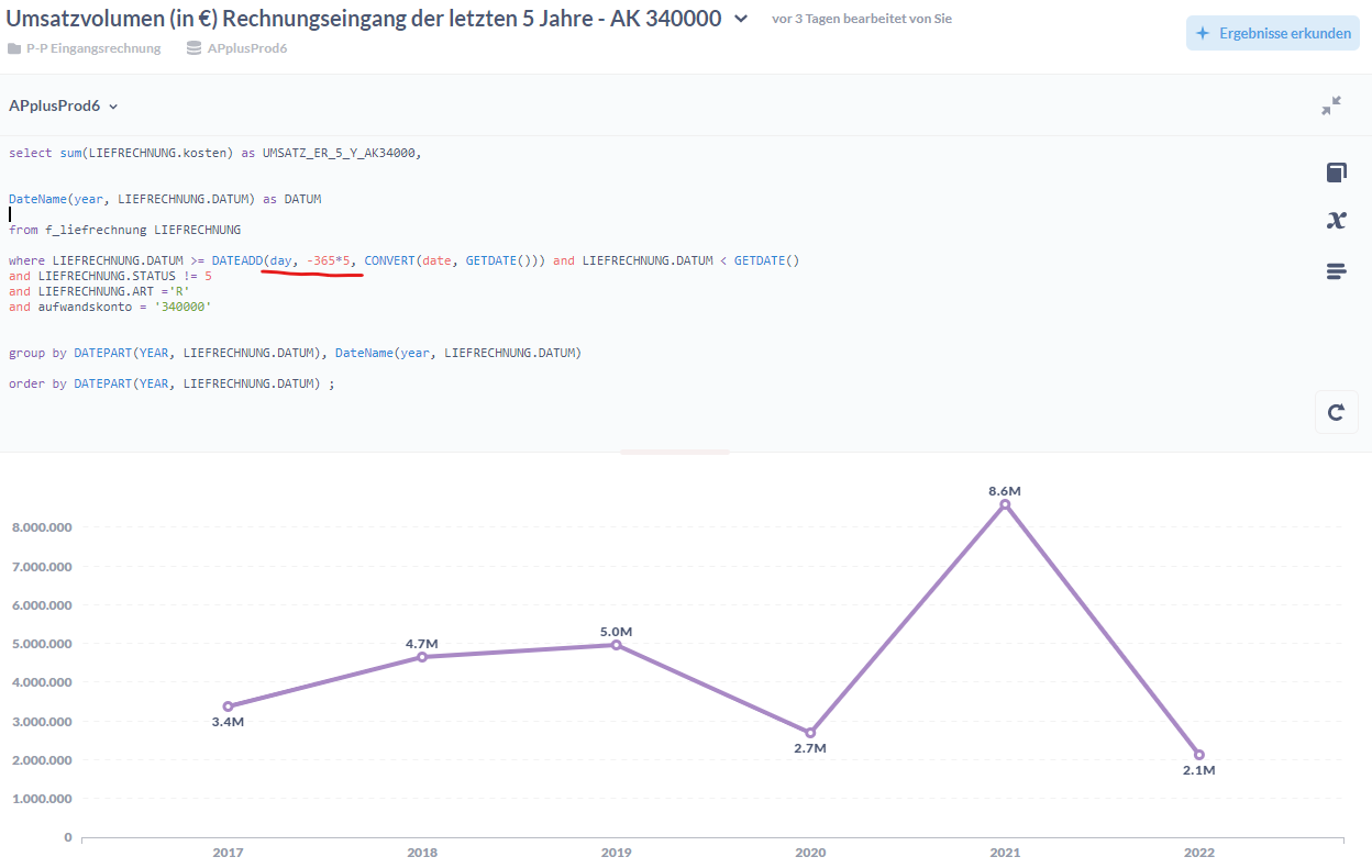
But I thought with the following query I would only include data from the past 5 years…
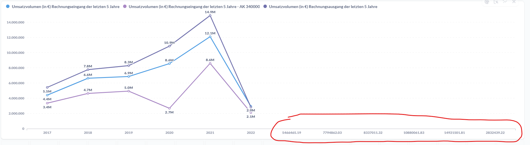
@Max1 Strange. Try changing all the questions to "X-axis scale"=Ordinal.
Then try removing the combined chart on the dashboard and create it again.
And make sure you're using the latest release: https://github.com/metabase/metabase/releases/latest
@flamber. Thanks again.
I did as you suggested. I changed all x-axis of all three questions to “Ordinal” and then rebuild the chart.
But it still looks exactly the same…
And I am already on the latest version v0.42.2
@Max1 SQL Server should return a string for DateName, so when I mock something similar, then I'm not seeing any problems. There must be some returned values somewhere. You would have to look at the rows being returned in the requests /api/card/:id/query
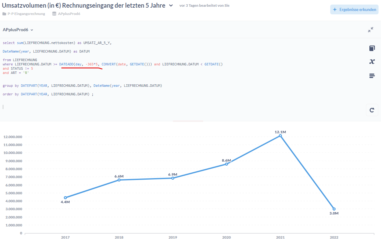
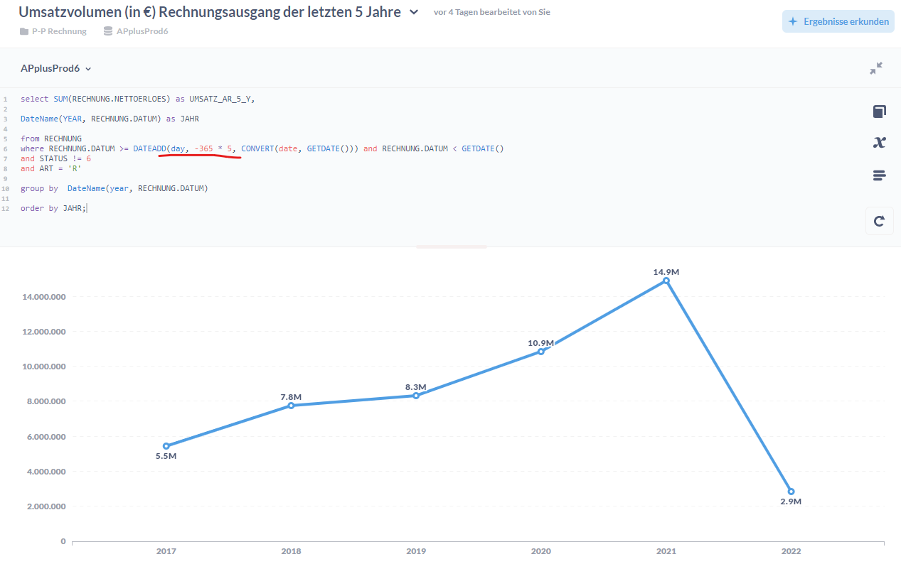
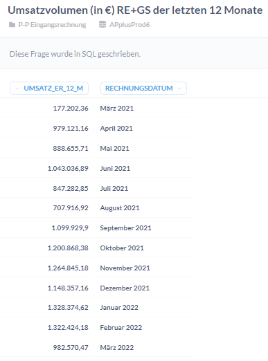
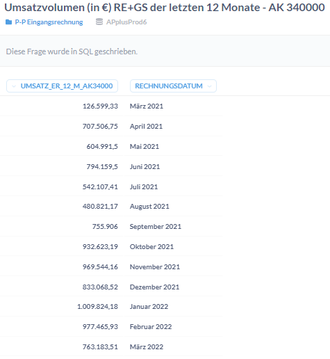
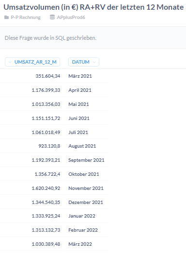
@flamber As you can see in the first three pictures, each query results in a normal looking table without any abnormal values. However, once I combine them into one chart, it shows me these weird numbers on the x-axes (picture 4).
@Max1 Yes, like I said, without seeing the actual data results from /api/card/123/query, where 123 is the question ID, for each question, then it's hard to tell what is going on. I cannot reproduce.