Hi!
I've done a very cool dashboard and i'd like to show it in my pulses or, at least, a good representation of it:
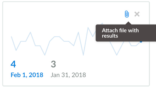
Of course, i now this isn
t replicable in a pulse but id like a better representation than what we have know (in the best cases an image like this):
Best wishes
1 Like
Hi @aitor.m
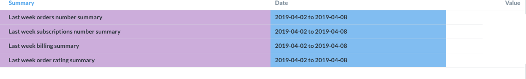
Then create a question, which returns data in a more computer friendly way, and use that for the pulse:
Date       | Value
2019-04-01 | 4
2019-04-02 | 5
2019-04-03 | 2
2019-04-04 | 7
...
I did it but, in my opinion, as a visualization tool is horrible, isn`t it?
That’s why i wrote here, because I would like to reproduce the query in a pulse in the same way that it appears in my dashboard
@aitor.m
Okay, I don’t understand then. Do you want the pulse to look like the first or the last image?
Pulses are very limited - they’re meant as quick indication.
If they looked like the first , it’d be perfect because i could show 4 requests in one query. That’s why i’m suggesting a new pulses policy or whatever just to add queries as they appear in dashboards.
@aitor.m
Okay, now I get it. That request already exists - go and upvote by clicking the  on the first post:
 on the first post: