Hello guys @ metabase.
I began to use metabase and simply love it.
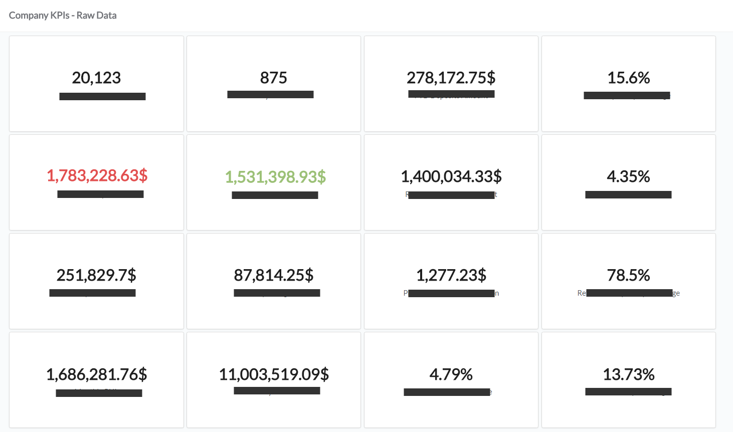
I enjoy the clean beautiful UI and mainly have been creating a dashboard of our company’s KPIs.
if I can suggest a small and very simple improvement, that can boost the dashboards even more are colors to text / numberic results.
in KPIs some data is good and some is bad, showing a ‘block’ with red content can make it pop and suggest a clear notification. I created a board with 15 numeric blocks and having some of them colored can improve it significantly.
Hello can I get a response for this?
your product's UI is great and this can upgrade it even more with a very basic improvement.
see illustration. say I have a board with several company KPIs, see how nice it might look if I have a value which is of negative effect and one with a positive effect. showing these with distinct colors really boosts the dashboard.
This is an interesting suggestion. Our next release will include a progress bar visualization option, which obviously isn’t the same as what you’re proposing here, but which could help better visualize scalars like these against a target value.

 on the first post