Hi! I need help wrapping my mind around "the Metabase way" of doing things.
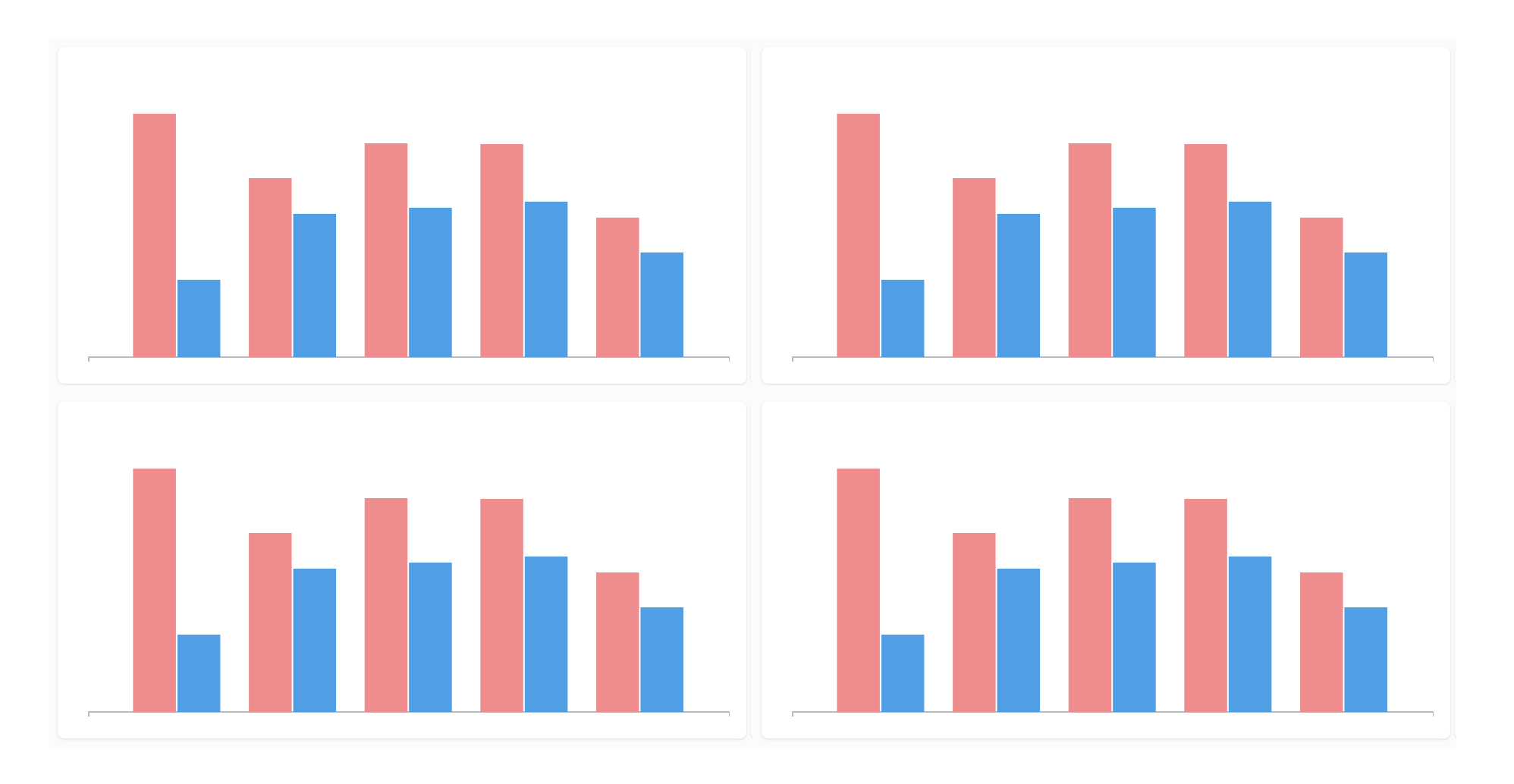
I have created a dashboard (successfully) that includes four charts. Each chart includes two data series — and each series is sourced from a different question. The dashboard roughly looks like this (actual data values and labels redacted):
You can guess that red/blue correspond to a categorial value, which I'm comparing for each period, across different metrics in each chart.
Anyway, to achieve this color-coding, I had to create a separate Metabase question for each series. So, this dashboard is actually pulling from 8 different Metabase questions.  This feels… excessive. Is this really "the Metabase way" of doing things, or is there a much simpler way I've overlooked? (For example, I'd find it more intuitive for each chart to be sourced from a single question, and have that source question include both series with the color-coded values.)
Thanks!
Hi @smurray
I think I might be misunderstanding what you're trying to do, but when you combine questions on a dashboard into a single card, then there's some auto-magic that tries to select different colors, when two questions are using the same colors. You can manually change the colors by going into "Visualization options" (palette icon, when hovering a dashboard card).
I don't understand why you're using 8 different questions - unless it's of course 8 different queries and results. If that's the case, then that's not excessive - how else would you expect Metabase to work?
When you have a question or problem, which is best described by showing full unredacted examples, but you don't want to show your data, then I'll recommend using the Sample Dataset.
Thanks, @flamber! I will check out the Sample Dataset.
Let me see if I can be more clear using words first. 
I have these four different charts looking at four different metrics on a single dashboard. So, yes, I would expect these to be sourced from four different questions (queries).
Within each of the four, I have data split out by two categories. Let's say red is "West Coast" and blue is "East Coast". So maybe the four charts show something like my total revenue (West vs. East), sales (West vs. East), retention (West vs. East), and losses (West vs. East).
Right now, to achieve showing both West and East in the same chart, I have 2 separate questions for each of these charts. For example, say the Revenue chart pulls from two different questions:
- Revenue (filtered to show only West Coast)
- Revenue (filtered to show only East Coast)
In the dashboard, I add the West Coast chart, then "add a series" to layer in the East Coast values.
Altogether it's 8 questions, but I would expect to be able to handle it in only 4.
Does that make sense? If not, I'll check out the Sample Dataset and try to capture what I mean. Thanks!
@smurray If you had "West Coast" and "East Coast" available in your data, then you could just group by that column, which would then show what you want, and you could have a filter to only show one of the coasts. That way, you would only need 4 different questions.
It very much depend on your data, so it's tricky to give recommendations or "best practices", since everyone have data in different ways and you need to make it fit into Metabase in a manner, which is easy for the users, but also easy for you to maintain.
Thanks, @flamber. I gave this a shot, but it was too complex for me. I think in the initial questions, I already had a "group by", so I was not clear on how to layer an additional "group by" and get the output I wanted.
Can't share the data publicly, I'm afraid, so I'm resigned to keeping this as-is for now. (I mean, it works!) Thanks for helping me think through it!