Don't like the new UI

Sorry for being direct, but I really don’t like the new UI (I upgraded from 0.32 to latest).

Very confusing that all buttons are placed somewhere else now. Some in top left, some in top right, some bottom. There is no clear reason for me why it’s this way now.

I don’t have issues with change in software usually, but this isn’t as well thought out it seems.

2 Likes

Thanks for the feedback, @nevil.

Maybe to elaborate a little:

The positioning of the buttons has a logic to it:

  • The top left is the summary of the query, and includes the metrics and breakouts when working with an unsaved question, along with the data its based on, and any filters that are applied to that data.
  • The top right has buttons that modify the query: adding filters, changing how the question is summarized (aggregated and broken out), and a way to open up the advanced, Custom editor.
  • The bottom left is visualization options: changing the type of visualization, and options for the visualization.
  • The bottom right are sharing and exporting options: download, public links, alerts.

One of the main goals of this redesign was to provide more space for the actual query results or the visualization, so we put a lot of thought into how to provide a UI that didn’t need the full query builder bar, but that would still be able to answer “what am I looking at?”

We know it’s a big departure from the previous query builder that many came to know and love. I hope it grows on you, but if there are more specific points of confusion or frustration, I’d love to know what they are so we can work on improving this new layout.

Thanks again.

1 Like

Thanks for the explanation, I appericate that. It's not an attack but hopefully some criticism you can work with.

As you've explained it sounds logical, but it still doesn't make it intuitive. I think intuitive should prevail above logic, especially in UI.

What I liked about the previous layout was that you immediately see data (in a table view) and only then you can start thinking about how you want to visualize or transform the data. Now I'm somewhat forced to think about it beforehand, and it takes me some clicks extra. It feels heavy.

Also the layout on the create question page isn't very structured:

I don't see why there are sometimes some icons here, it isn't obvious what they do. There is no text, and it's a bit randomly placed it seems. Again, I really prefered all options all being side by side in the previous layout. You immediately get what you can do. Now you have to look to each corner, and remember what is where. I also have a very wide screen which makes it a bit more strenuous to go to each corner.

I would personally prefer to get rid of the create question screen (screenshot above) entirely, and just show the table view after selecting a database table.

Also the menu header is unneccesarily complicated:

image

Why not just 2 buttons? A plus icon (with subitems: ask question, create dashboard, create puls), and a gear icon for settings. That's all you need there.

The browse data screen seem unnecessary too, there is no added value in that feature. It's the same as ask a question as far as I can tell.

My suggestion is to simplify as much as possible, remove bloat and keep the amount of clicks that is needed to see data to a mininum. Hope this helps!

(by the way sorry for the partly dutch screenshots, I have set my language in settings to English, but it somehow still displays almost everything in Dutch)

Just disovered that if you click here, there is an even more different question screen:

It looks quite different then the screenshot is my post above. But it seems like it's basically the same thing, but in a different layout. That makes things a bit more confusing too.

It's kind of a bummer, why change something if it was working just fine in 0.32?

1 Like

You might want to take a look at these two links:

Okay and why is that? Not sure what you’re saying.

I agree with @nevil. To me it’s like I have to learn asking questions in Metabase from scratch. I got used to old UI and I found it very intuitive. To me, the most problematic is no real time preview of data after changing filters. Now, I have to click ‘preview’ every time I want to see the result of my filtering.

1 Like

@ActionHank It sounds like you have disabled “Automatically run queries when doing simple filtering and summarizing” located in Admin > Databases > (db)

@nevil, I just meant those docs do a good job of explaining what the two different graphic query building modes are for, and what you can do in each of them.

The Simple mode was built to enable quick, interactive explorations and visualization of data for less experienced users or for quick-and-dirty queries. The Custom editor always displays the full graphical representation of any GUI-based query, and can be used to perform more advanced functions, like joining data, using the results of a saved question as starting data, writing out formulas for custom columns or metrics, or doing multi-step aggregating and filtering.

Our opinion of the old query builder was that it was too complicated for novice users, yet too underpowered and cramped for more advanced users. It was a constant struggle to figure out how to increase the power of it by introducing joins, multiple metrics, filter expressions, etc. without breaking the UI. Simultaneously, the old query builder didn’t always map to the mental models of novice users, who were coming from backgrounds using Google Sheets, AirTable, and the like.

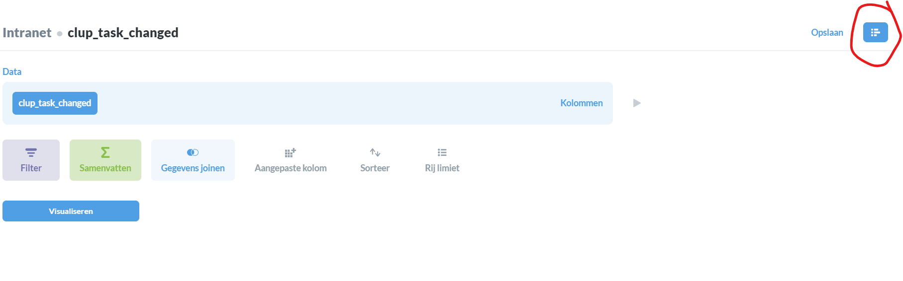
Regarding the buttons below each step in the Custom question mode, those are the steps that are available to be inserted right after that existing step. The buttons are not always exactly the same because it does not always make sense or is not always possible for a particular step to happen after another step. This mode is meant to be viewed as a sequence of steps, top to bottom.

By the way, if your goal is to see data rapidly and then decide how to query/aggregate it afterwards, the Browse Data button in the nav is probably the fastest way, and is an answer to why it is a distinct action vs. asking a new question. You can click it to quickly see the contents of your databases, and clicking on a table will immediately show the raw data for it. It also defaults you into Simple query mode, from where you can then filter or aggregate the data, or click that editor button in the top-right to toggle into Custom mode if you’re trying to do something more advanced. Because the New Question and Browse Data actions are so common, we chose to not hide them under a submenu click.

@actionhank, sounds like you’re talking about in the Custom query builder how if you’ve displayed the preview of an intermediate step, if the step (like a filter step) changes, you have to click the Preview button again. This is a trade off as we have many users for whom even the preview queries could take a long time to run or be expensive operations, but I do understand where you’re coming from.

I totally agree with @nevil unfortunately. The new UI feels a whole lot less intuitive, especially the simple question mode.

Some of our users are novice and non-technical and loved the simplicity of the previous UI, because it was a "from left to right" process. Now, they really don't know how to create their questions because the filtering, summarizing functions and visualizations buttons are spread on different places. Frankly, the bar has been raised a lot according to these users in the simple mode.

I totally get the separation of the simple/advanced mode, but my (and my colleagues) experience is that the simple mode is much harder to use compared to the previous version.

If the simple mode could have the old UI, and keep the new UI for the advanced mode you would make my day :slight_smile:

I agree with @mangefager and we notice same behaviour from our users. The advanced query mode “notebook” is really good and intuitive when you are an advanced user, from my point of view it’s ok.

But for non-technical users the simple mode is not intuitive as all. The previous one was really better and more easy to understand for them.

Thanks for the feedback, all. We’ll take this into account as we continue to work on improving the product for all our users.

Hi,
This thread is a bit old because we have just finaly made the update and we discovered the new interface to ask questions. I’ve cried a lot :-(((
It’s much less intuitive and slower than the good old way of asking questions, which was so simple, fast and intuitive (for myself “novice user” coming from the likes of Excel. I’ve always loved Metabase because of how simple it was compared to PowerBi for instance or other comparable software, but this simplicity has dropped A LOT with the new interface)
I don’t really see how you gain room for the data, and you could still have a button “show full editor” if you need another type of interface to implement power-user features like joins etc.

6 months after the update, maybe you could ask your long time users who have known the previous way of doing things if they would like to go back?

2 Likes