Description
I created a quick'n'dirty dashboard using the sample DB of the Person table:
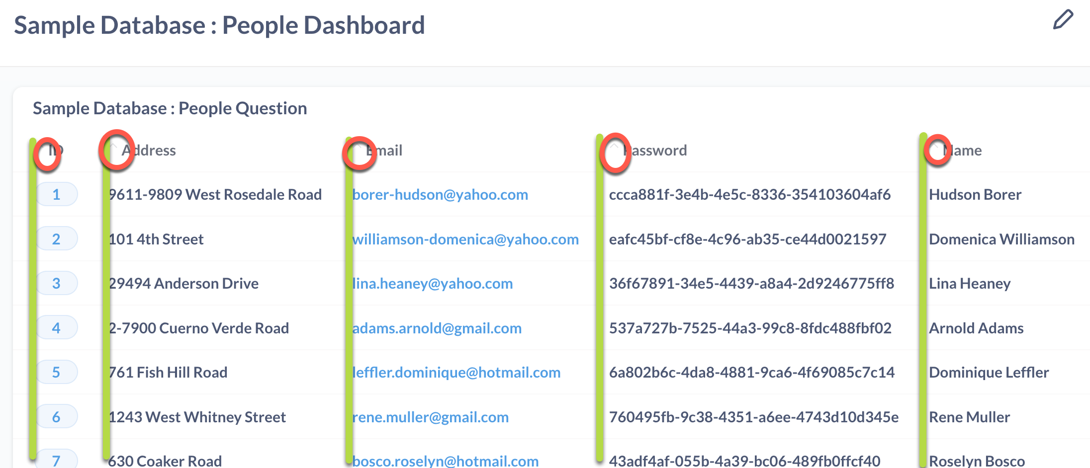
I used a green line show the alignment of the columns, and the red circles to illustrate where the "extra" whitespace.
Question
Is there a way to turn this off this extra whitespace and make the column headers a bit larger? I think there's an icon for sorting the header, but it's not aesthetically pleasing in our dashboards.
In fact, the dashboards at Up our table layout game · Issue #4621 · metabase/metabase · GitHub look better because the column headers are bold and font size appears slightly bigger.
Any suggestions would be greatly appreciated!