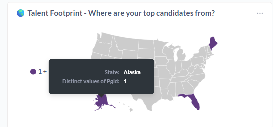
Ideally, I would want that tooltip to say “# of applicants” instead of “Distinct values of pgid”.
If this is already a feature and I’m just missing something obvious, please do let me know! But, so far, I’ve encountered this issue with many different types of visualizations.
it is pulling field names directly from the questions, without an option for me to modify that text, which makes this look terrible and results in confusion for my audiences.
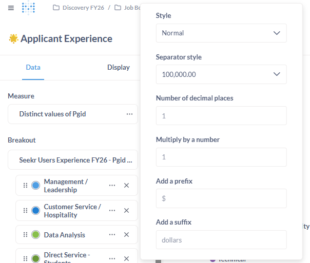
These are just two samples - it would be nice to be able to have control over those details.
There’s numerous places to set “pretty” column names.
For a visualization, open the settings sidebar. You can edit the series (click the 3-dots widget) and click in the text box next to the color and type the name you want. The original column name appears nearby. You can rename breakouts this way, too.
X- and Y-axis labels can be changed on the Axis tab.
If you need to change database column names, use a custom expression. The body of the expression is just a reference to the source column, like [my_funky_column_name]. Name it whatever you want the pretty name to be. It can include spaces and the like.
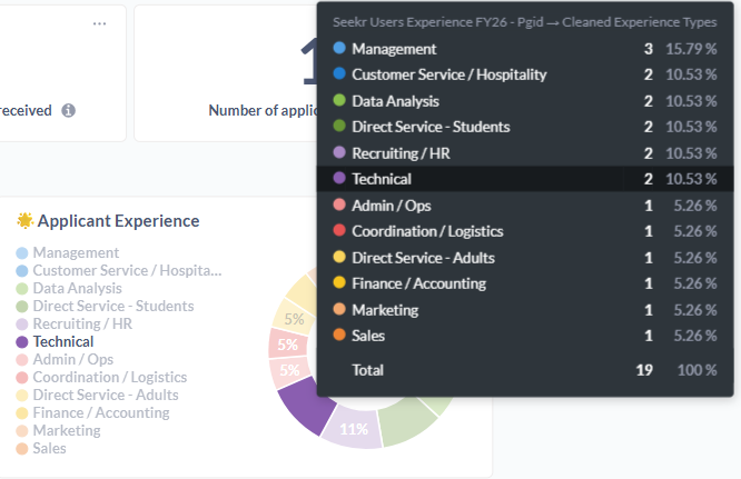
As you can see, the categories are all properly formatted already. The name of the actual field (Seekr Users Experiences FY26 - Pgid…” is not.
Creating a custom expression solely for renaming purposes seems like a terrible workaround - especially in my situation, where I have a data model that combines five tables with 100+ columns.
The functionality I described is standard for most other BI tools.
I also see you reference the X- and Y-axis. What you describe is indeed possible for bar graphs, but not for donut/pie charts. It’s confusing that it is a native option for some but not all visualization types.
yes this surprises all the community, all tools void to add other categories or measures/kpi in tooltip and an important addon could be add also other different visual object in the tooltip (Power BI Like) and not only values…
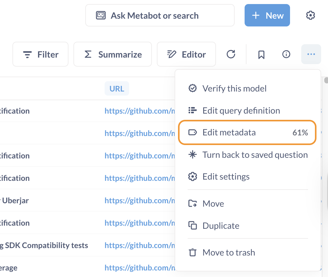
Hey, I know this is not the solution you are asking for, but since you are using a model to build that visualization, you can adjust model metadata and rename the field Seekr Users Experiences FY26 - Pgid… to something more user-friendly.
Here is how to do that.
Open your model
In the … menu select “Edit metadata” (see screenshot)
On the page that opens up select “Columns” tab
Then click the column that needs to be renamed and in the right-side panel input new name into the Display name field
The visualization tooltip in that pie chart will now display the new field name
That works if the model doesn’t use any other joins. That’s the issue at hand here - this is a model that I am joining with another table that makes my field names a mess.