TL;DR
Please add a Multi-row Card visualization that shows several label–value pairs in a single tile (one data point per row), similar to Power BI’s multi-row card. It would let us group small numbers of KPIs or short facts into one compact card instead of scattering them across multiple single-value tiles or falling back to a table.
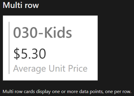
What it is
A Multi-row Card displays one or more data points, one per row inside a single card.
Each row renders a Label (muted) and a Value (emphasized). This is ideal for “stat blocks” and quick summaries.
Why Metabase needs it
- Fewer tiles, clearer stories — group 2–6 related stats in one place.
Better than tables for small N — tables feel heavy for short summaries.
Consistent layout — avoids alignment headaches with multiple single-value cards.
Great for embeds & mobile — compact, scannable KPIs.
How it could work
Input
Any question that returns up to N rows. Users pick which columns represent:
- Label (text)
Value (number or text)
Basic settings (MVP)
- Row limit (e.g., show up to 5 rows)
Sort by (value asc/desc or label)
Show/hide label
Number formatting (integer, percent, currency)
Honors dashboard filters and drill-through (click a row → see underlying).
Nice-to-have (later)
- Secondary text (caption/subtext per row)
Prefix/Suffix for values (e.g., “Matches”, “%”)
Icons/emoji column (optional)
Conditional formatting on the value
Compact vs. spacious density; subtle row dividers
Works in public/embedded contexts and exports
Typical use cases
- A short KPI block (e.g., “Active users”, “Monthly visits”, “Return Rate”).
A weekly ops summary (brief narrative stats without a full table).
Segment highlights (e.g., by location, product line, or channel).
Quality signals (e.g., engagement %, top categories).
Why existing visuals don’t quite fit
- Single Value only shows one data point per tile → too many tiles!!
Table is visually dense and not KPI-styled for small sets.
Acceptance criteria (MVP)
- New visualization type: Multi-row Card.
Map columns to Label and Value.
Supports number formatting, sorting, row limit.
Respects filters/parameters; supports click-through.
Responsive and accessible (screen-reader friendly).