I'm using the maps visualisation tool to share relevant feedbacks with my B2B merchants about their B2C customers.
Some feedbacks:
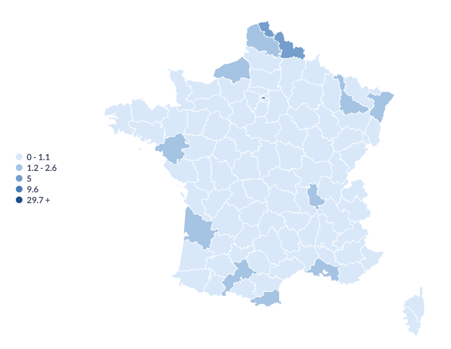
- I need to display data in percentage of the total nb of customers, but it's not possible (the only format accepted is in absolute value, so 50% is written as 0.5 -> Really not looking good).
- The legend on the left is not very readable, and not straight forward. It would be great to have the scale of colours from the lightest to the darkest.
- The colours on the map could be more contrasted
- It would be great to being able to identify the top region, lowest region with a specific visualisation.
- It would be great to being able to display the most important values (largest values in my case).