When I visualize my data by combo chart, it feels ugly somehow, in detail, the data label is not appeared as I expected
- Firstly,
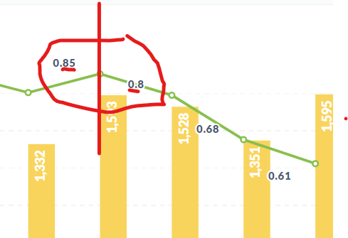
I set my data in percent style, it worked when it's the only data that I showed in my visualization but when it stands with others column, the percen style setting had gone.

- Secondly,
Same picture that I capture above, the data label seems hard to recognize that which point it link to, as you can see, the number 0.85 -> 0.8 -> 0.68, it placed at two sides of the point, the viewer may feel lost in finding which point it link to.
- Your browser and its version: Chrome - Version 91.0.4472.124 (Official Build) (64-bit)
- Your operating system:
Edition Windows 10 Home Single Language Version 20H2 Installed on 3/27/2021 OS build 19042.1052 Experience Windows Feature Experience Pack 120.2212.2020.0
- The type of database(s) you’ve connected to Metabase: Google bigquery
- The version of Metabase you’re running: ** You're on version v0.38.5**