Hi All,
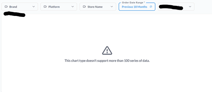
I have a brand as a filter and restaurant as a filter on a dashboard. Whenever for a specific brand the number of restaurants go more than 100, the bar graph displays error because it cannot show more than 100 series of data. For different brands, the number of restaurants changes for example, for brand A no. of restaurants is 50, for brand B no. of restaurants may be 101.
Is there a way to show data in bar graph for 100 restaurants only, whenever there is a case of brand that has more than 100 restaurants?
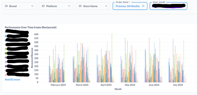
The limit is in fact 100 ... Why would you need more than 100 series? Like can you share a screenshot of 99 series. I cannot imagine a chart that is legible with even more than 20 let alone 100 ![]()
Suppose for a brand we have 102 restaurants, so when the final dashboard is rendered on customer's website, they won't be able to see the bar graph without selecting some restaurants filters first. We want that no matter the number of restaurants, at least the bar graph should show up initially, even without applying any filter.
Case 1: Before selecting restaurant in the
filter
Case 2: after applying restaurant filter
Why don't you simply show this info on a table? The chart itself isn't very useful for that large series. Or limit by top 10 or bottom 10
1 Like

