Hi -
Is is it possible to ensure that my dashboard subscriptions are sent in a similar format to the way they appear in the dashboard?
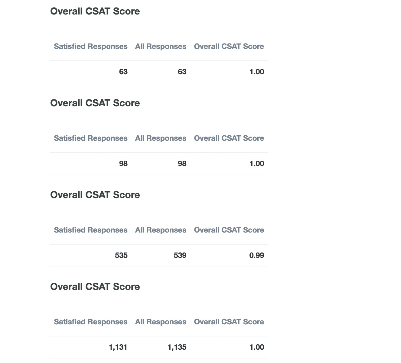
For example, you can see here below that I have four CSAT tiles that are named differently in the dashboard to indicate the different time periods.

But in the email, it just uses the same title from the original tile, so you can't tell which belongs to which. What's more, it doesn't show the visualization I chose, but instead shows all the values from the query.
Ideally, it would just send a PDF of the exact dashboard that we worked so hard to format in a way that is understandable, not just break up the tiles and send it.