Hi,
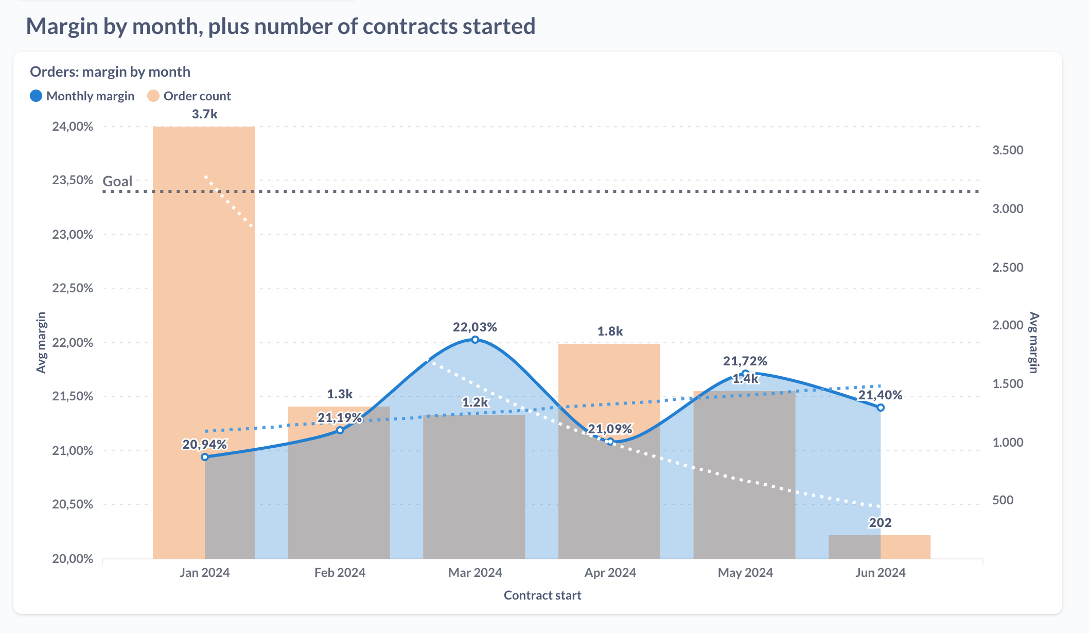
I have a dashboard, with this graph on it, showing line chart (left Y-axis, in percentage format) and bar chart (right Y-axis, numbers)
In the dashboard, it looks like this:
When sent via email, it looks like this:
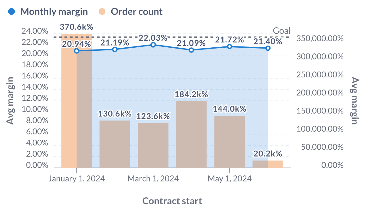
Please notice these differences/faults in the email version:
- x axis: should have abbreviated months
- left Y-axis scale is different, email starts at 0, should start at 20%
- right axis: email has copied left y-axis settings, resulting in January value to display as 370.6k% instead of 3.7k
- trend lines have disappeared
- Monthly margin line should be a smooth line, isn't anymore in email
It seems like the email rendering engine decides to use some unclear subset.
Very hard to predict what will and will not work this way...
Using Metabase 0.49.8, own hosted server.