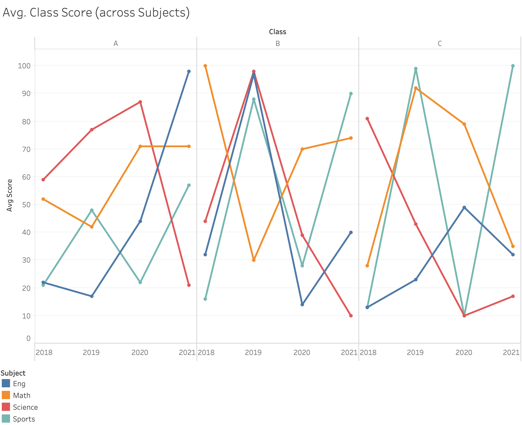
Class	Subject	Avg Score	Year
A	Math	52	01/01/2018
A	Eng	22	01/01/2018
A	Science	59	01/01/2018
A	Sports	21	01/01/2018
B	Math	100	01/01/2018
B	Eng	32	01/01/2018
B	Science	44	01/01/2018
B	Sports	16	01/01/2018
C	Math	28	01/01/2018
C	Eng	13	01/01/2018
C	Science	81	01/01/2018
C	Sports	13	01/01/2018
A	Math	42	01/01/2019
A	Eng	17	01/01/2019
A	Science	77	01/01/2019
A	Sports	48	01/01/2019
B	Math	30	01/01/2019
B	Eng	97	01/01/2019
B	Science	98	01/01/2019
B	Sports	88	01/01/2019
C	Math	92	01/01/2019
C	Eng	23	01/01/2019
C	Science	43	01/01/2019
C	Sports	99	01/01/2019
A	Math	71	01/01/2020
A	Eng	44	01/01/2020
A	Science	87	01/01/2020
A	Sports	22	01/01/2020
B	Math	70	01/01/2020
B	Eng	14	01/01/2020
B	Science	39	01/01/2020
B	Sports	28	01/01/2020
C	Math	79	01/01/2020
C	Eng	49	01/01/2020
C	Science	10	01/01/2020
C	Sports	10	01/01/2020
A	Math	71	01/01/2021
A	Eng	98	01/01/2021
A	Science	21	01/01/2021
A	Sports	57	01/01/2021
B	Math	74	01/01/2021
B	Eng	40	01/01/2021
B	Science	10	01/01/2021
B	Sports	90	01/01/2021
C	Math	35	01/01/2021
C	Eng	32	01/01/2021
C	Science	17	01/01/2021
C	Sports	100	01/01/2021
Ah, not sure if that will help produce similar results. Thanks though! @flamber
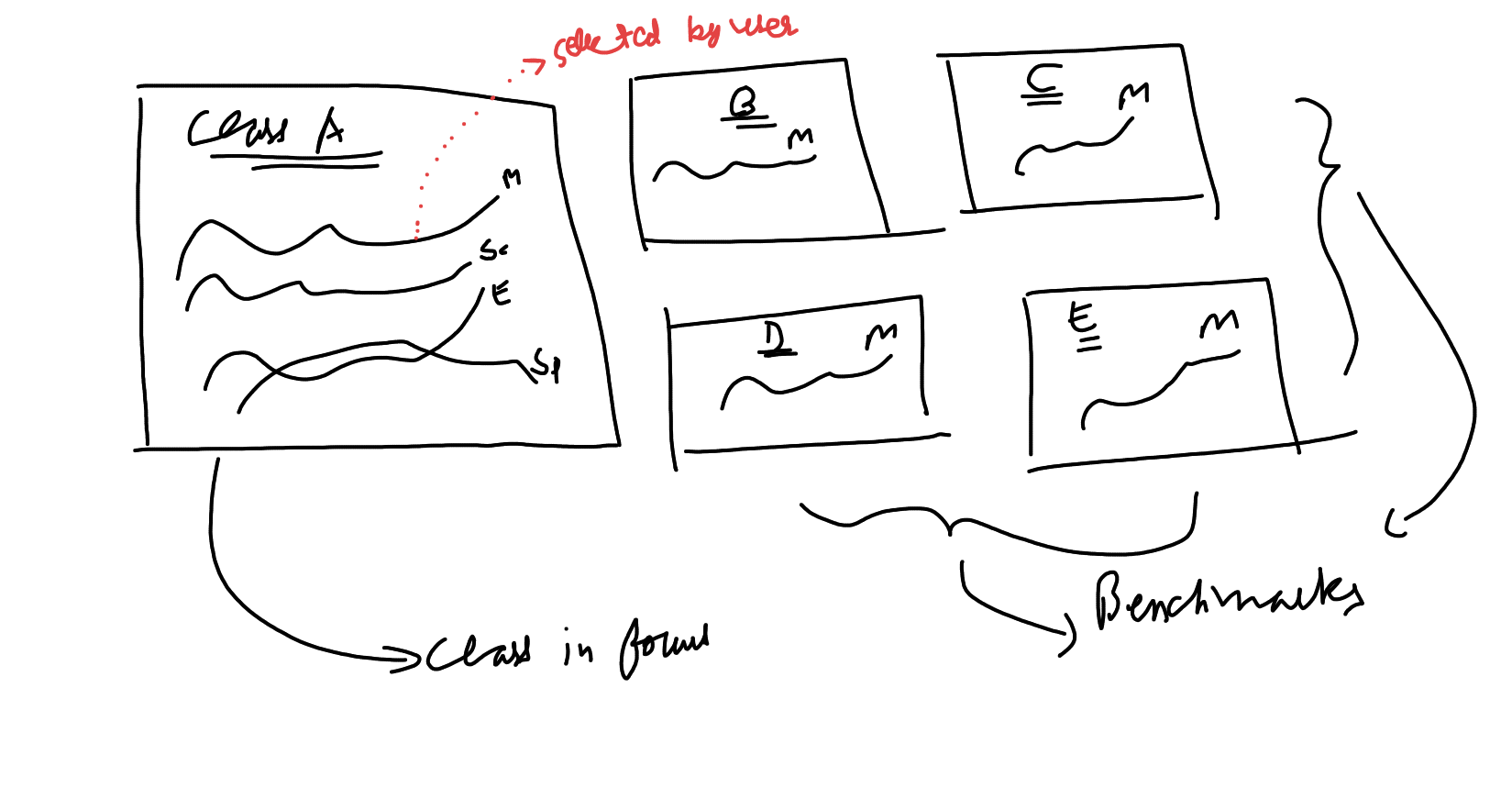
Thinking out loud, maybe creating different questions for different classes altogether may work here. But let's say I want to put one class in focus and benchmark it against others, could there be a way to control the other classes' charts using the one which is focus?
Eg - I create a big chart for Class A (in focus) and three small ones for B, C and D. I show 4 lines in Class A, but only want to show the one selected by the user on Class A chart on the other charts. So if the user chooses 'Math' on Class A chart, Class B, C, and D charts will show only lines for that subject and so on...?
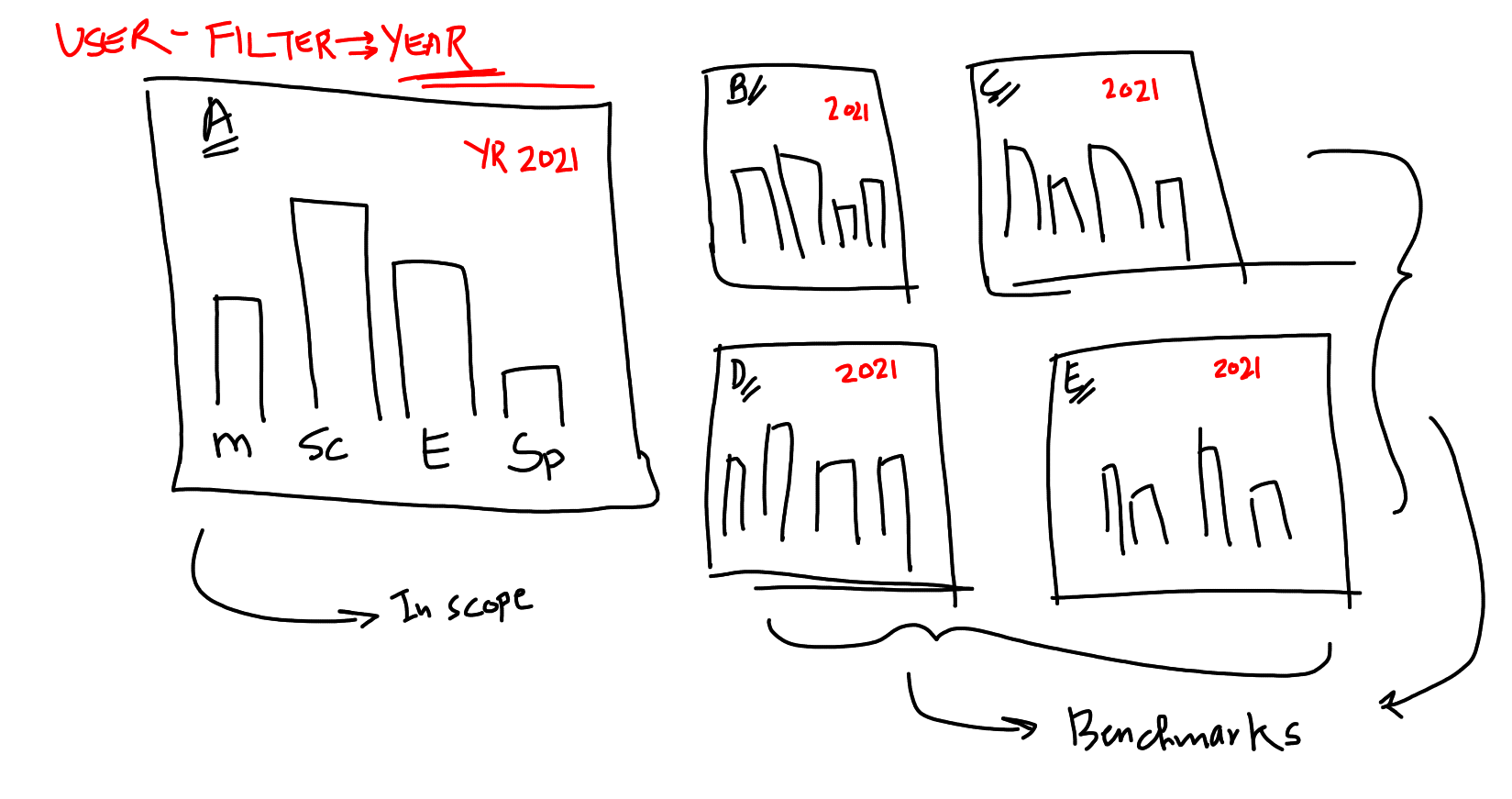
Or maybe a version like this one where we filter on a specific year for comparison. But I'm afraid we lose the possibility of spotting trends over long periods of time.
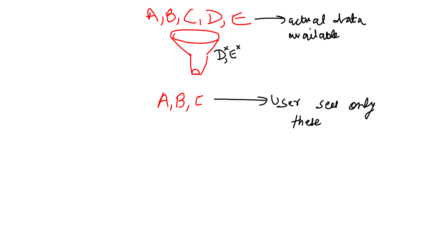
Also, is there a way to limit the options I want to show on a filter? I do want to give the interactivity to the user but I don't want them to use all the values available in a filter.
Let's say there are the following choosable options in a filter: A,B,C,D,E. I only want the user to be able to see A, B, and C. Can I do this in a dashboard or do I need to filter out the D and E data at the question level?
 on the first post