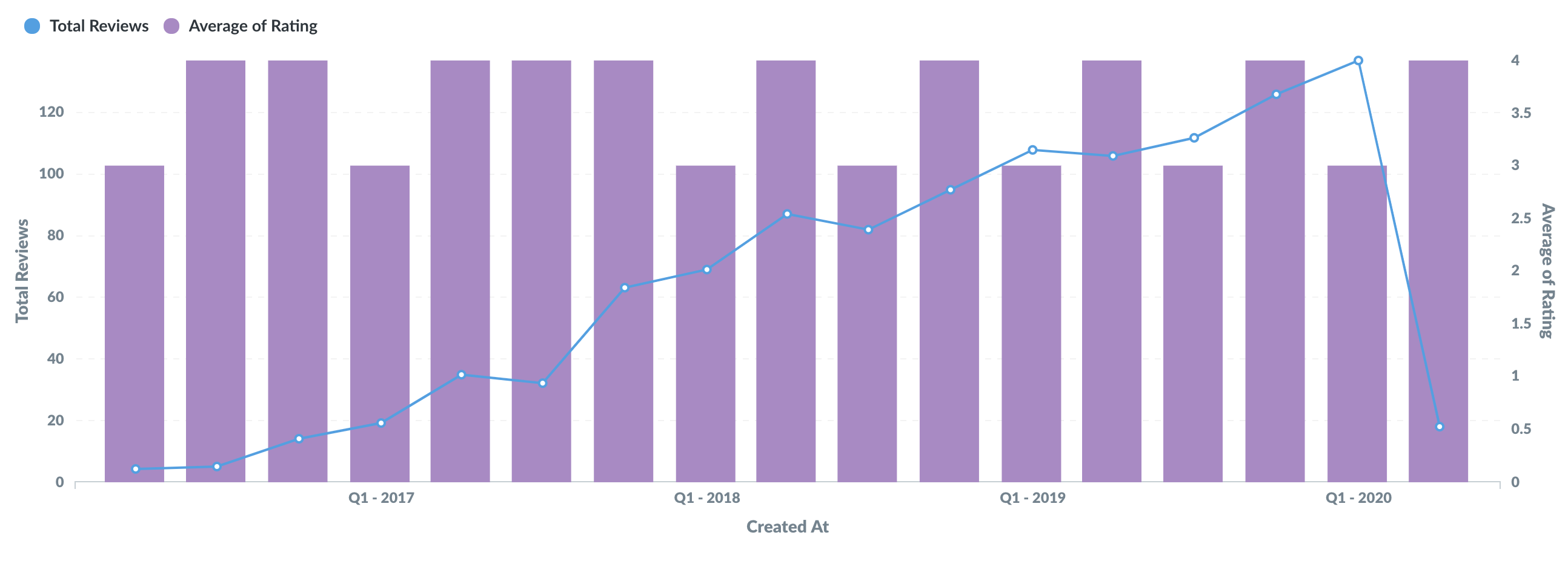
The line makes sense when the X-axis is numerical or ordinal, but it doesn’t make sense when it’s categorical. Is this type of visualization possible? If not, can this be an added feature?
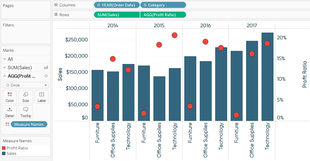
I fiddled with this but wasn’t able to reproduce it. Metabase’s scatter plot doesn’t play well with other plot types and isn’t supported as a mixed plot type.
That said, I’m not sure a chart like this really says anything. The red dots seem to have nothing to do with the blue bars. Perhaps this is better visualized as 2 separate charts?
FYI I got these charts from Google Images just looking for examples. I’m purely interested in the capability in Metabase, not at all in the data in these example images.
With that said, is it possible at all to have a bar + dot combo chart with no line? And if not, can this capability be added?
As far as I can tell, no, you can’t combine bar and dot plots. The screenshot you posted is from Tableau, which has a lot more flexibility in defining chart elements.