Hi everyone,
I’m trying to replicate a financial dashboard that was originally built in Power BI inside Metabase, and I’m running into several limitations, especially with the compact matrix-style table at the bottom.
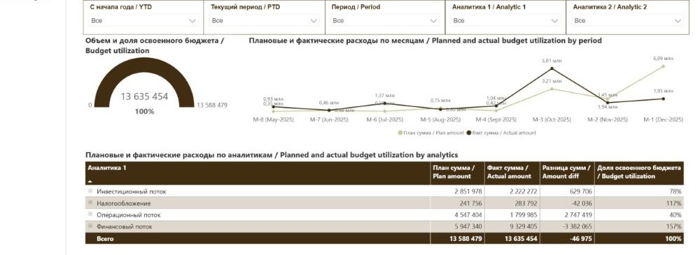
The dashboard consists of a header section with multiple filters (YTD, PTD, Period, Analytic 1, Analytic 2), a gauge that shows actual versus plan with the maximum value equal to the total plan and displays budget utilization in percent, a line chart with two metrics (Plan amount and Actual amount) by month (displayed like M-8, M-7, etc., and ideally formatted in millions), and a compact matrix-style table that summarizes budget utilization by Analytic 1.
The most challenging part is the bottom table. It contains rows such as Investment flow, Taxation, Operating flow, Financial flow, and a Total row. The columns are Plan amount, Actual amount, Difference (Plan minus Actual), and Budget utilization percentage. In Power BI this is implemented as a Matrix visual with calculated columns and subtotals, and the layout is very compact and clean.
In Metabase I’m struggling with several things. First, creating calculated columns inside a grouped table (for example Difference and Budget utilization) in a clean and reusable way. Second, adding a proper total row that behaves consistently with the grouped rows. Third, making the table visually compact with reduced spacing between rows and columns. Fourth, formatting numeric columns consistently (currency, percentages, possibly millions display). And finally, achieving a matrix-like layout similar to what Power BI provides.
At the moment it seems that the only reliable way is to build the whole table using a native SQL query with pre-calculated fields and a UNION ALL for the Total row, but I’m wondering if there is a more “Metabase-native” approach using pivot tables, models, or saved questions.
What would be the recommended pattern in Metabase for building financial reporting dashboards like this? Is it best practice to push all calculations into SQL, or is there a cleaner modeling approach that works well for this type of reporting? Or should I dive into code?
Thanks in advance for any guidance.