I got a dataset that has [ID(primary key), Terminal_ID(which terminal), update_time(the time when the data was recorded), status(0 is offline, 1 is online), timer(how long the terminal kept its current status)
ID Terminal_ID update_time status timer
1 4402 2016-06-21,11:34:01 0 8
2 4402 2016-06-21,11:34:09 1 70
3 4402 2016-06-21,11:36:01 0 0
4 4503 2016-06-20,22:01:00 0 10
...
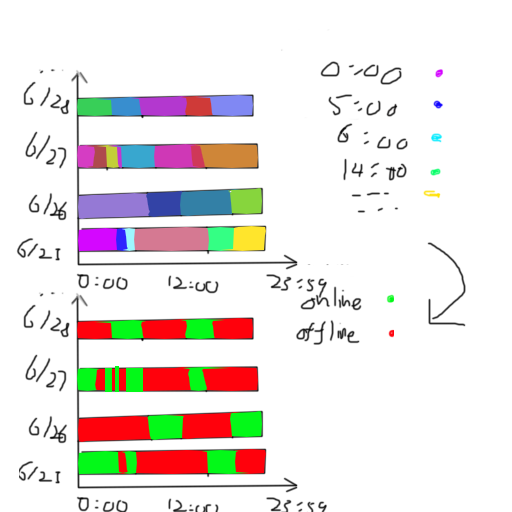
I wanted to show when and how long a terminal changes its status throughout the entire day. I was trying to get the bar chart just like the bottom image below.
The colors of the bars would never be determined by the status, instead, they were created by the update_time (like the first chart in the image).
Is there any way either from SQL query or frontend code so I could achieve the effect of the second chart? I am sorry I am too bad at presenting in English ; ;