I want to visualize a timeseries with many values (one entry every 15min) as a line chart.
The Problem seems to be, that Metabase only shows 2.000 values. Which is less than a month. As stated in other threats, this seems to be a hard limit from deep within metabase.
How can I circumvent this?
Or how can I visualize the data otherwise?
I tried creating a model which aggregates the data to show only one value per hour. Or one value per 6 hours. Then I can see more days. With one value per 6 hours, I can visualize a whole year. The problem is, that I am loosing the zoom functionality. When using the 6-hour model, I can zoom, but I can not see more than 4 values per day.
Hey there, I would approach this challenge asking myself if it makes sense to create a single visualisation that fits all your needs, or if instead make sense to have multiple vizs, each of them giving you specific insights:
one chart based on values every 6 hours, allowing you to have a great understanding of the overall behavior.
one chart based on values every 20 minutes, allowing you to keep on eye of what is happening almost in real time.
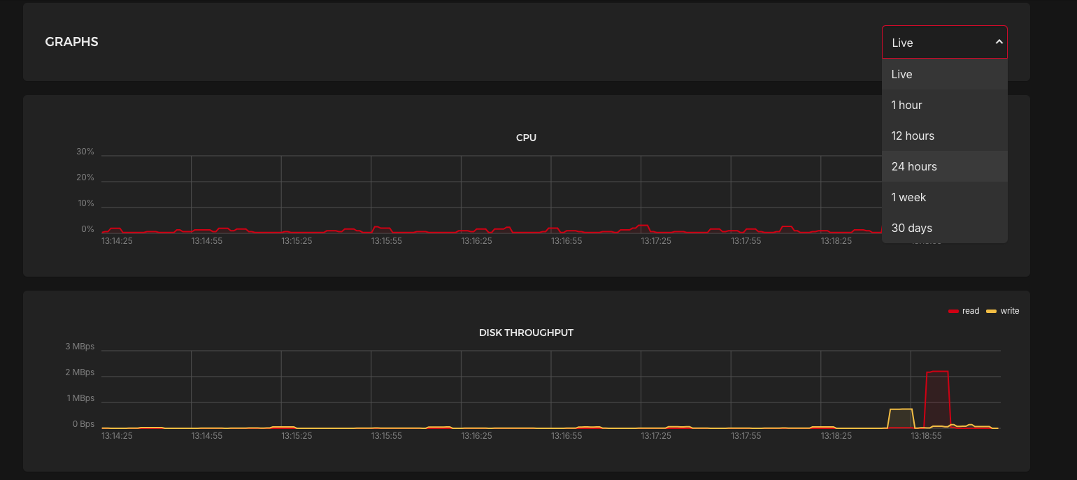
As an example, Hetzner Cloud Ui (server management) gives users the possibility to see charts about their servers. As you can see in the screenshot below, they have a drop down menu allowing to see the trends for specific timeframes.