Hello,
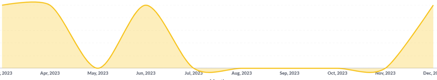
I'm trying to make a line chart using the smooth lines option. When using zero for missing values instead of linear interpolation (which isn't an option for me, it just makes users think there are results that don't exist) I get the below issue. If you use the normal 'spikey' line option it isn't here.
I realise it's probably do do with the way the line is drawn but couldn't it be clamped to not go under? As of right now it basically makes the graph option unusable for any case where we might not get results since it leads to endless user questions about why things are going negative.
For the time being, I think you'll just need to go 'spiky'.
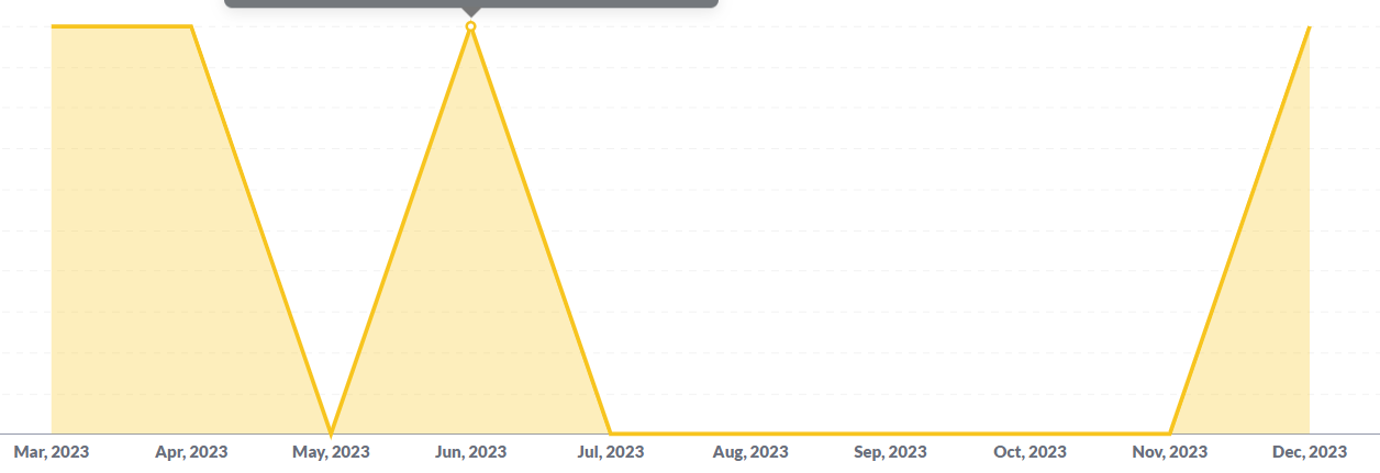
I get the same:
I tried using the 'block' style instead but that was even worse as it displayed the zero as though it was the same as the previous value.
Could you do a bar chart instead?
I'll probably do the bar chart, it just doesn't look as pretty for measuring multiple bits of data over a long period at a glance.
I tried using the 'block' style instead but that was even worse as it displayed the zero as though it was the same as the previous value.
Go to your visualisation settings and make sure missing value is set to either zero or nothing not linear interpolated which is the default. That's what gives the weird repeat values. Annoyingly it can be hard to get this behaviour to be 'sticky' when you might not know for sure how many different values will be graphed (e.g. new products coming online) without changing that setting for each one sometimes.