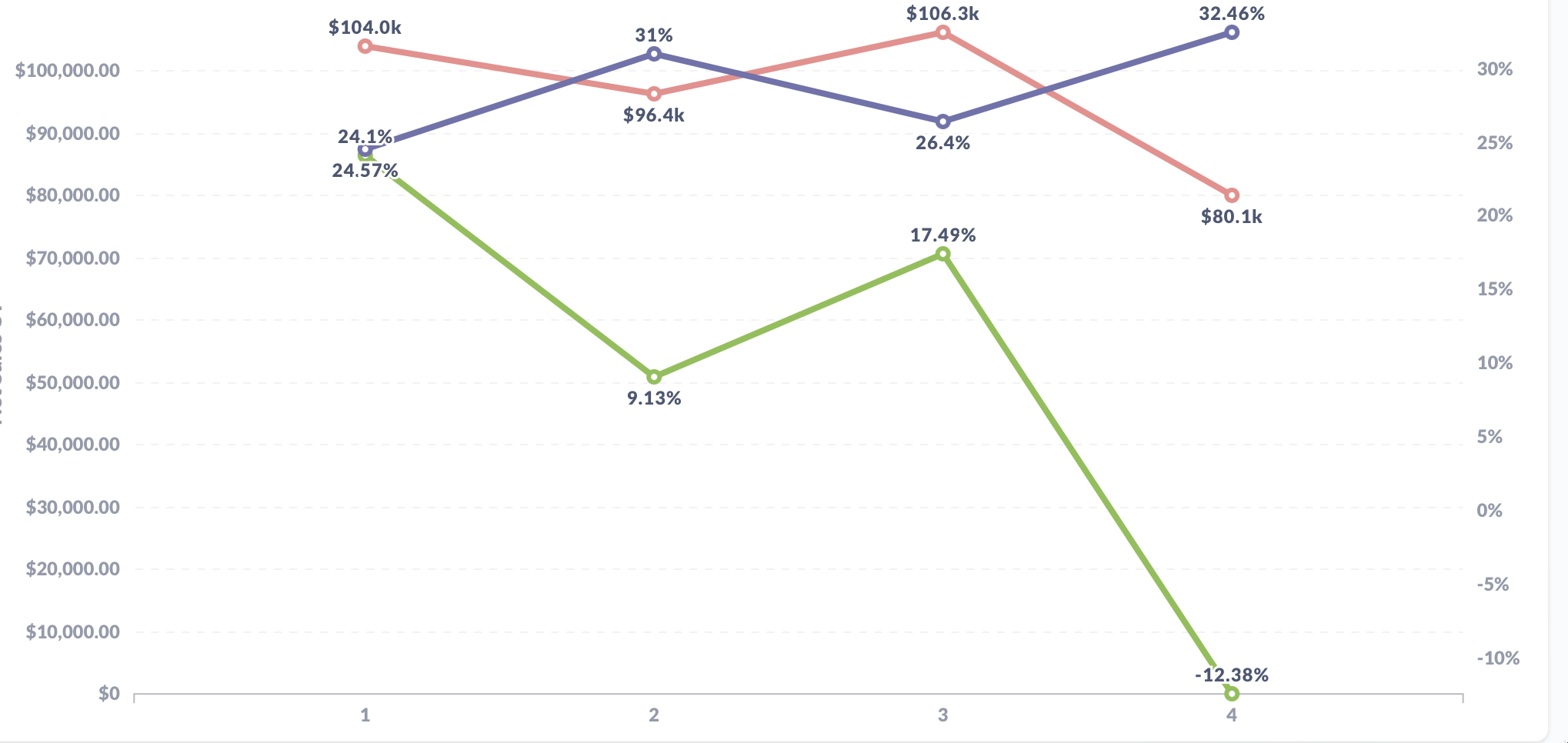
I have a dashboard with Line chart having dual axes - primary to show $ and secondary to show %, however when I subscribe the dashboard to an email, the chart shown on email has dollars for both the axes.
This is on the dashboard,
and this one on the email,
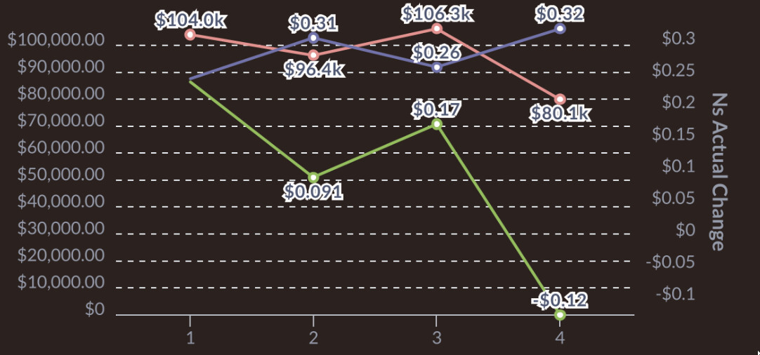
You're seeing Incorrect Y-axis unit in subscription email for line chart · Issue #27942 · metabase/metabase · GitHub, please upvote it on the first comment
1 Like