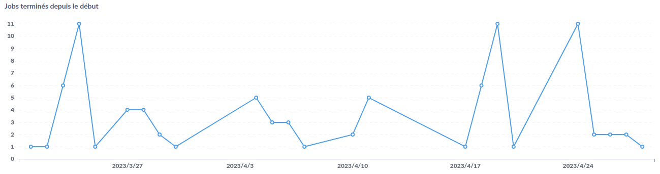
At work, we start "jobs" and we add those in a DB. I created a Metabase question to plot the number of jobs started each day. This gives this plot which I'm satisfied about.
But then I realized that there are "missing data". For example, we do not start any job during the weekend and sometimes during the week, like
5 jobs on april 11
0 job on april 12, 13, 14, 15, 16
1 job on april 17
It looks like several jobs were started from april 12 to 16, which is not just misleading but false. No interpolation should be done. I would expect the line to go to zero. This being said, I understand why it's not working that way! There's simply no data for april 12 so no point is added, and the line is drawn between existing points. This is all normal.
I'm aware that I could group the jobs by week instead of day, but then I would have the same problem if there's no job for a whole week.
My question is:
Is there a way to fix this problem? How can I add values/points for the missing dates?
If not, is there another visualization that should be used?
After some research, I coded it myself in SQL (inspired from this SO answer) because I doubt that Metabase offers that option.
SELECT g.dt::date, COUNT(jobs.ended)
FROM generate_series('2023-03-01', CURRENT_DATE,  interval '1 day') as g(dt)
LEFT JOIN jobs
    ON jobs.ended::date = g.dt::date
    AND jobs.ended IS NOT NULL
GROUP BY g.dt::date
ORDER BY g.dt::date;
This will create a column of dates from 2023-03-01 to today that I join with my actual data. The result is that it puts 0 on data without jobs.
I also have the a similar scenario. And coding all my queries in SQL is just not feasible as many of the queries are generated by end-users. Surely an option should be available to trigger the interpolation or not?
IIUC this is more complex than "interpolation". The problem is that a line chart is always "interpolating" from point A to point B, simply because it's a line. A bar chart would "fix" this specific problem, but not the actual problem described above
In my case, I had
...
2023-04-11 | 5
2023-04-17 | 1
...
We're using a line chart which is not actually aware of what is it plotting. It's adding a point on all (date, count) then adding a line between those points. We can't really ask for more than that. It's a good behavior.
This being said, there's the option in the Axes tab: Timeseries -> Scale which seems to do half of the job (adding more distance between points). So the line chart kinda understand that's it's dealing with linear values (dates), it just doesn't know what to do with missing values.
If I had to code it, I think I would do: when Timeseries is selected, add a "missing value" option where the user can write a constant. Metabase could use this constant on all missing X values.
This is now available. When you create a line graph and visit the "Line options", there will be a triple-dot menu on each Y-axis dataset, from this menu you should find "Replace missing values with" & the options Zero, Nothing, Linear Interpolated.