Hello. I just started using it and just love it.
I usually add very basic SQL queries so I made a very basic attempt with the query builder to show customer registration this year per month on a chart.
for some reason, the first month displayed in the x axis is DECEMBER 2015, although as seen in my image the initial data is from January 2016. its a simple issue with the axis display. I was wondering why is it like that and if anyone got this kind of behavior as well, adn how it was prevented. thanks.

managed. guys @ metabase or someone please advise how can I close / remove a discussion in case I feel it shouldn’t be here… thank you.
what do you mean “managed”? Did you figure out why this is happening or is it still a problem?
Hello Sameer and thank you for the fast reply!
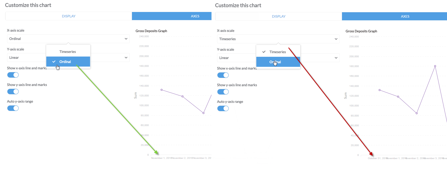
I think so. it seems to have been resolved when I switched the X-AXES scale settings from Timeseries to Ordinal.
as long as I can see nothing else have changed, so this works for me.
Huh. That seems a little odd.
Do you have a reporting timezone set? Would you mind sharing that + your browser/computer timezone? Something seems odd if timeseries axis are misinterpreting months.
didn’t have reporting timezone, just set it as GMT. I’m in GMT+2, but my DB and all data is displayed based on GMT./
I’ll see if that helps.