Hi,
I have an issue with combo charts in dashboard email updates.
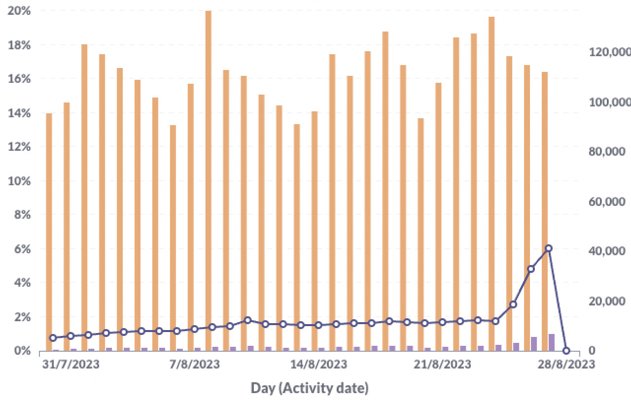
I have a chart with a split Y-axis including a line (left axis), and 2 bars (right axis). It works well in Metabase.
In the email, the line is automatically set on the right axis, and as it's a percentage it gets very low and unreadable.
On Metabase:
On email:
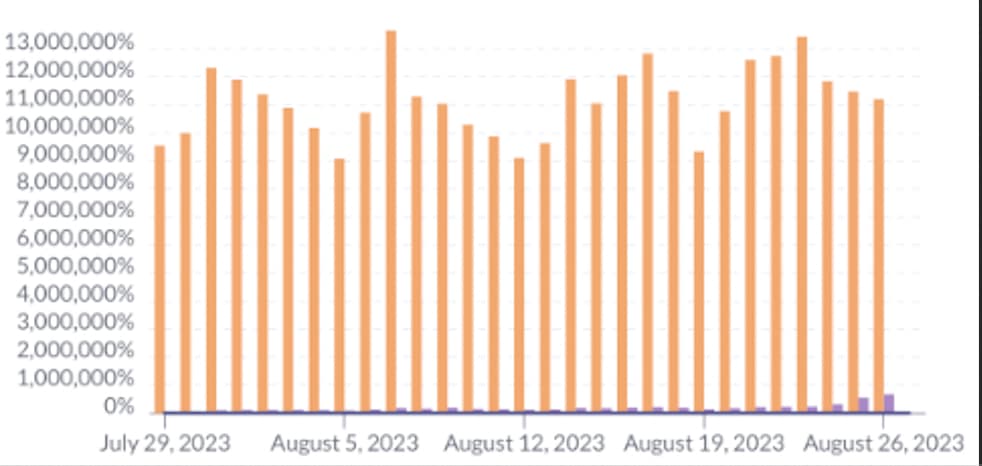
The purple line shouldn't be flat at the bottom on the email. Also, the left Y-axis shouldn't be in % on the email.
I have this issue on multiple dashboards, and on all combo charts.
Thanks in advance for your help,
Théo